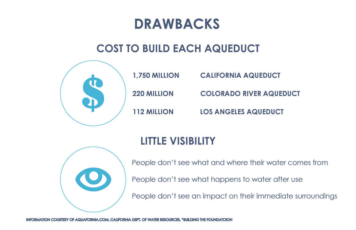
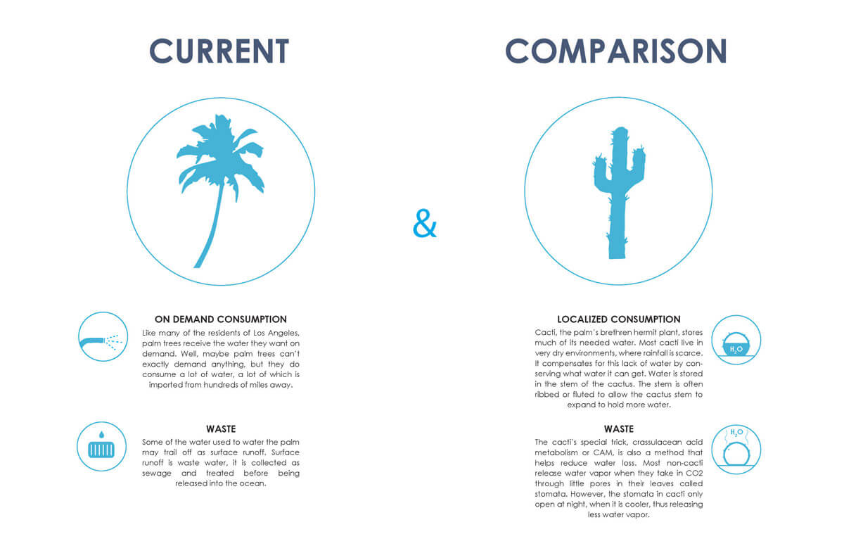
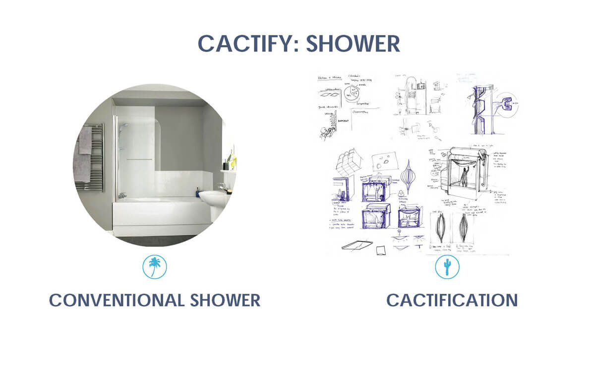
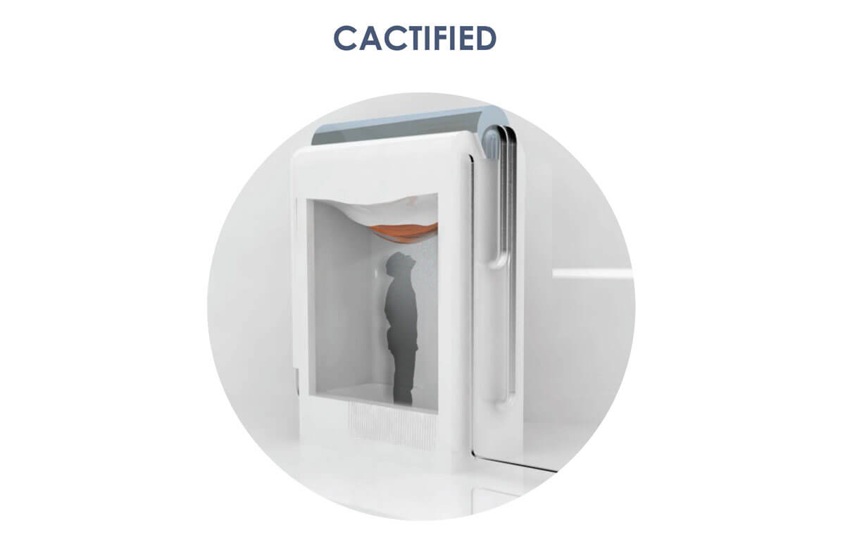
tools:
plant product photos courtesy of Leaf and Clay
According to an online survey I conducted, out of a group of about 30 people, 15% of people refrain from buying plants, simply because they don’t trust themselves to keep the plant alive.
Gathering information from students, coworkers, friends, and family, I surveyed about 30 people to learn the following:
What sort of online shopping experiences are most people comfortable with?
What kind of expectations and struggles do they have?
What kind of people would most likely buy plants online?
What are user backgrounds? Which user needs are most common?
Most users are concerned with receiving an item that does not meet their expectations.
of users have used Amazon to shop online.
of users consider reviews the most important factor in deciding whether to buy a product.
of users buy plants for themselves.
of users buy plants as a gift.
of users don’t buy plants because they can’t keep them alive.
During my research, I found that there are already plant stores that include plant care information. However, there are two key areas where houseplant could rise above the competition. These include:


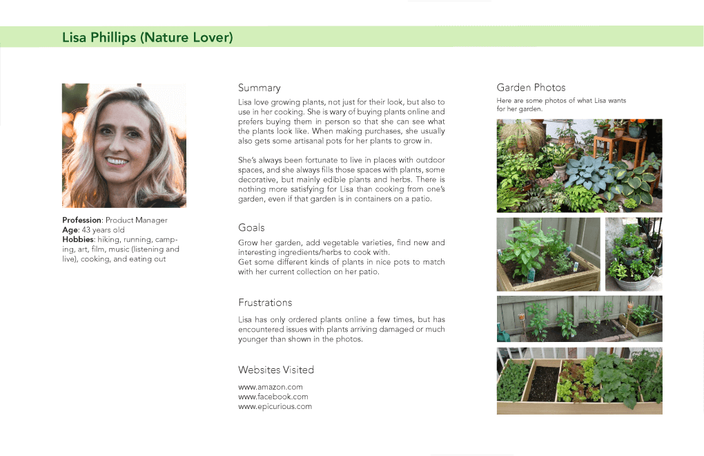
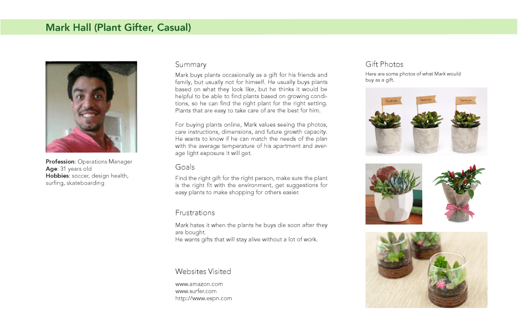
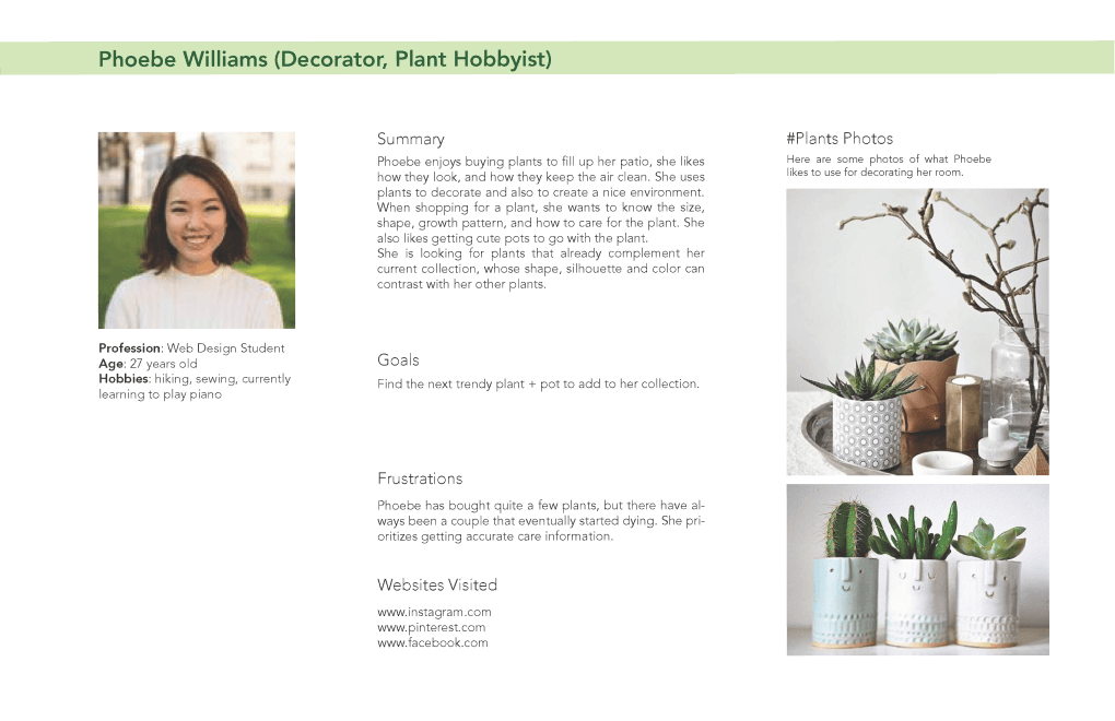
I conducted a few interviews to learn more about expectations and frustrations surrounding the experience of plant shopping and shopping online. Three types of common users emerged, but the most common is the plant hobbyist, houseplant's core user.
By getting to know potential users, I could better strategize and streamline their shopping experience.

strong knowledge on plant care
wants accurate shopping information and reviews

little knowledge on plant care
wants attractive plants that are easy to care for

no knowledge on plant care
wants an attractive, cost effective, and no fuss gift
Because houseplant is all about helping people with black thumbs, I wanted it to look warm and personable.
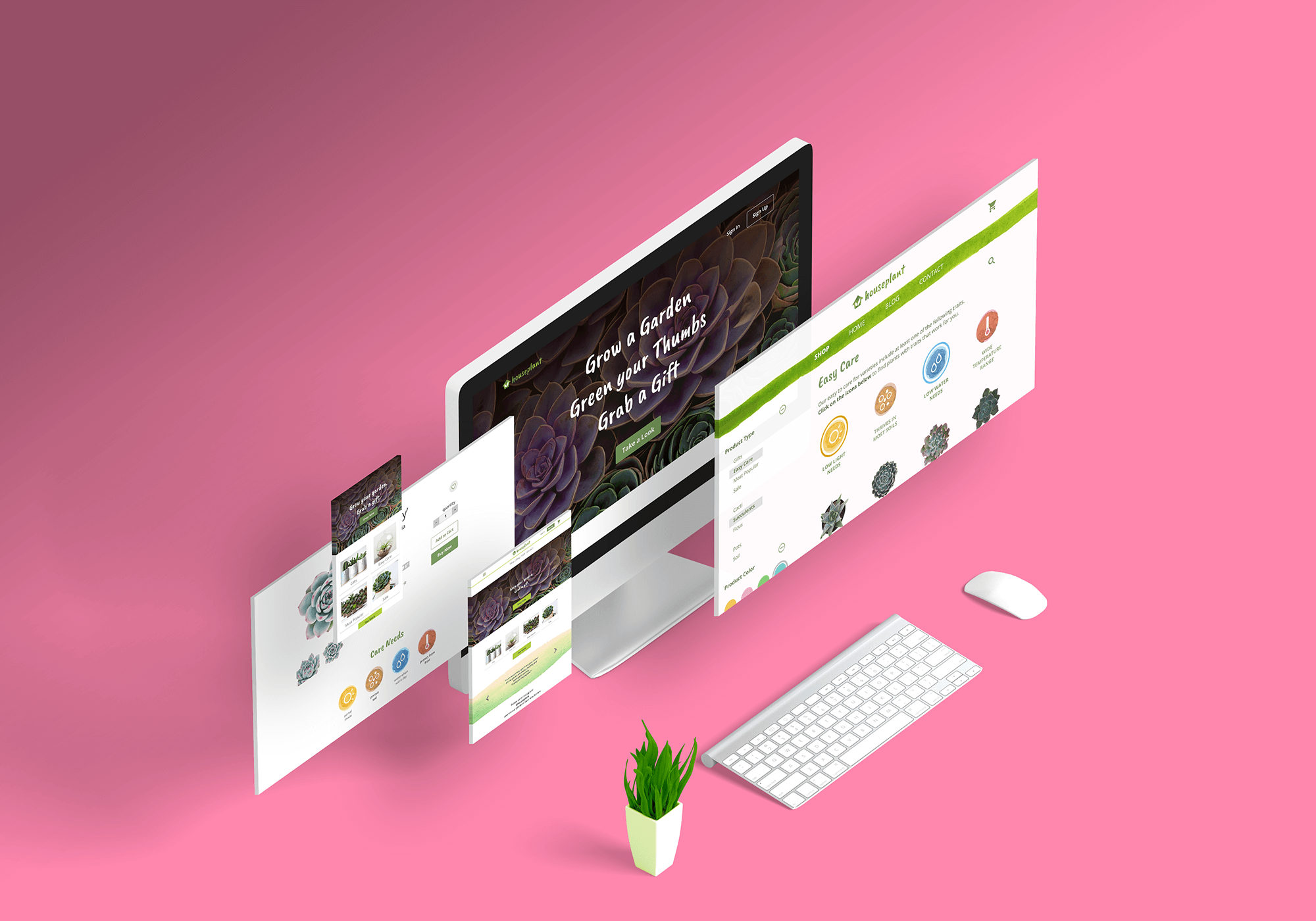
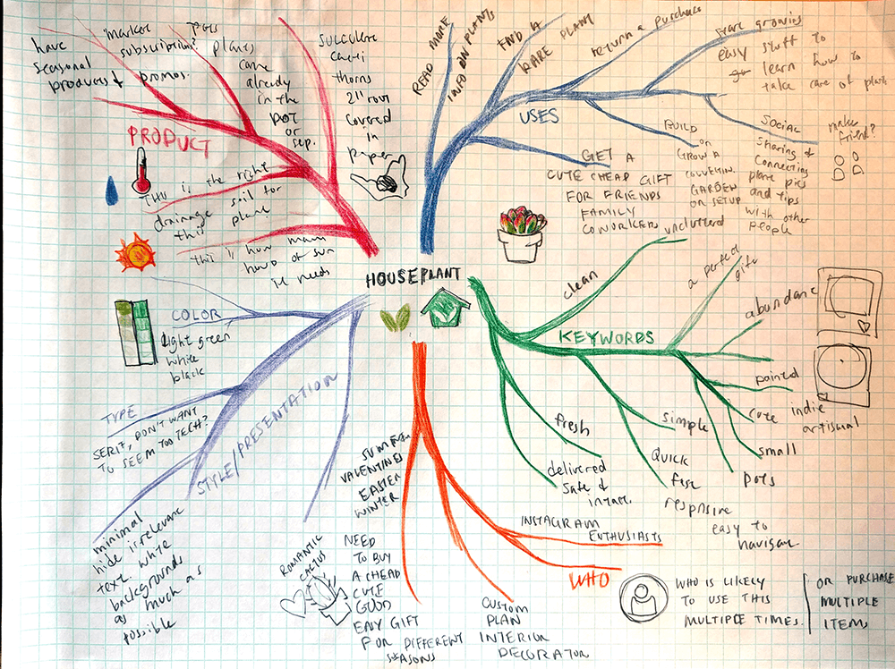
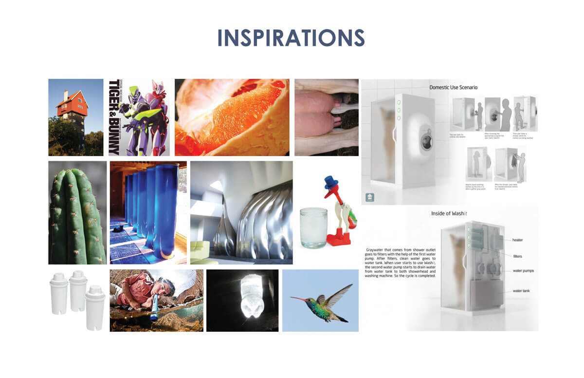
1. Finding Inspiration. While searching for visual inspiration, I noted how effective a minimal design is for showcasing products. To differentiate houseplant from competitors, I looked for ways to break away from the typical minimal look. I found that watercolor illustrations can add flair and humanistic qualities to a design. I hoarded watercolor, plant, and minimalistic images that I could later use for reference.
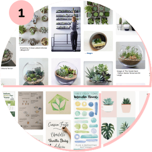
2. Loose Thoughts. At this point, I did not know much about my store, other than that it sold plants. Scribbles and loose sketches helped lead me towards the name 'houseplant' and ideas for the logo.
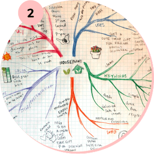
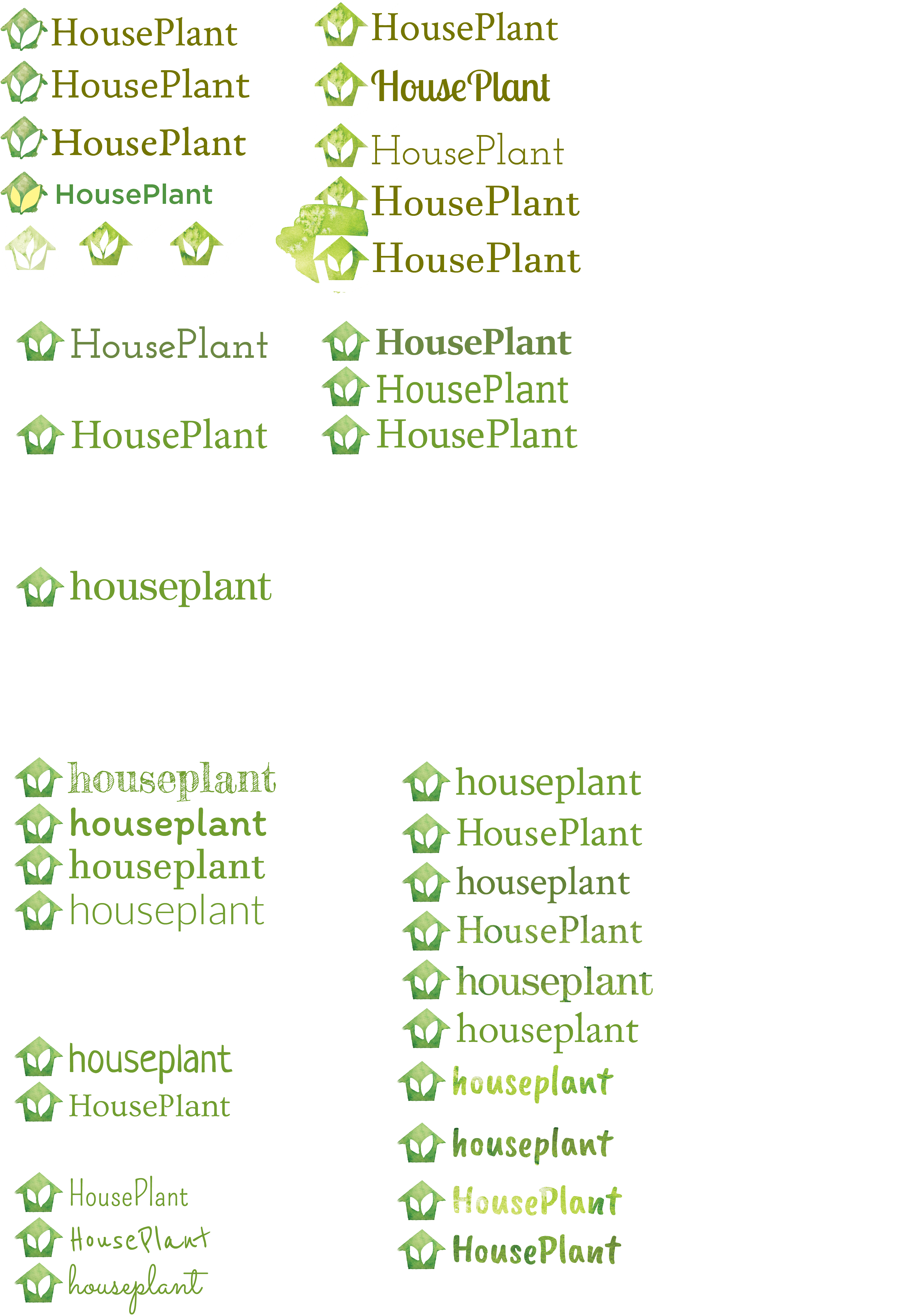
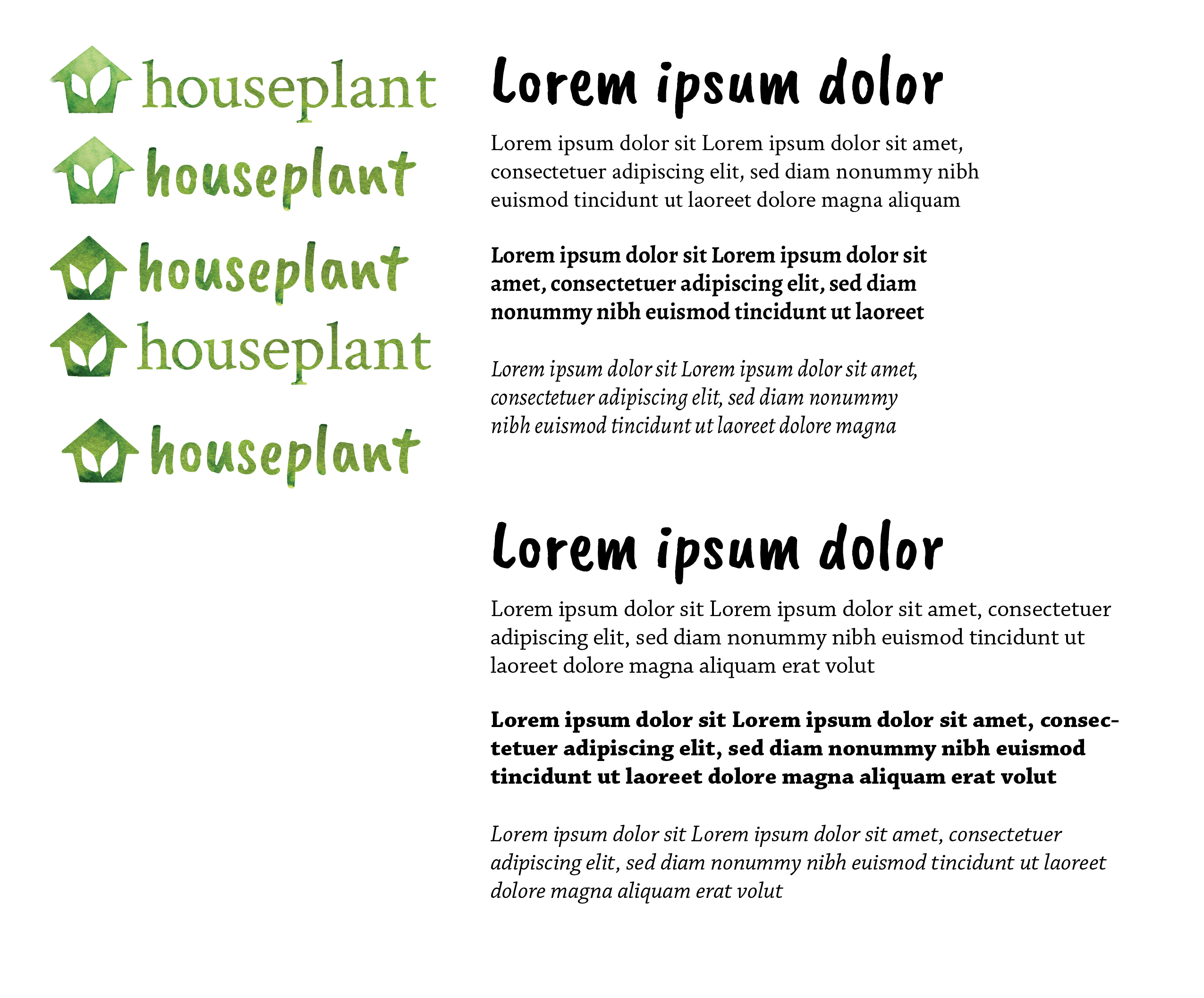
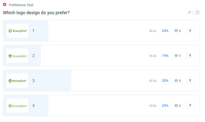
3. Honing In. I combined watercolors and the name 'houseplant' to create a simple logo. After many iterations and a round of preference testing, I chose 'Caveat Brush' as the wordmark typeface because of its hand-drawn feel.
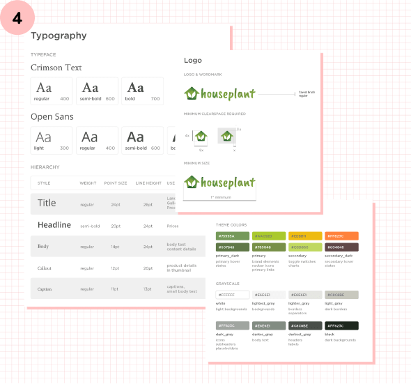
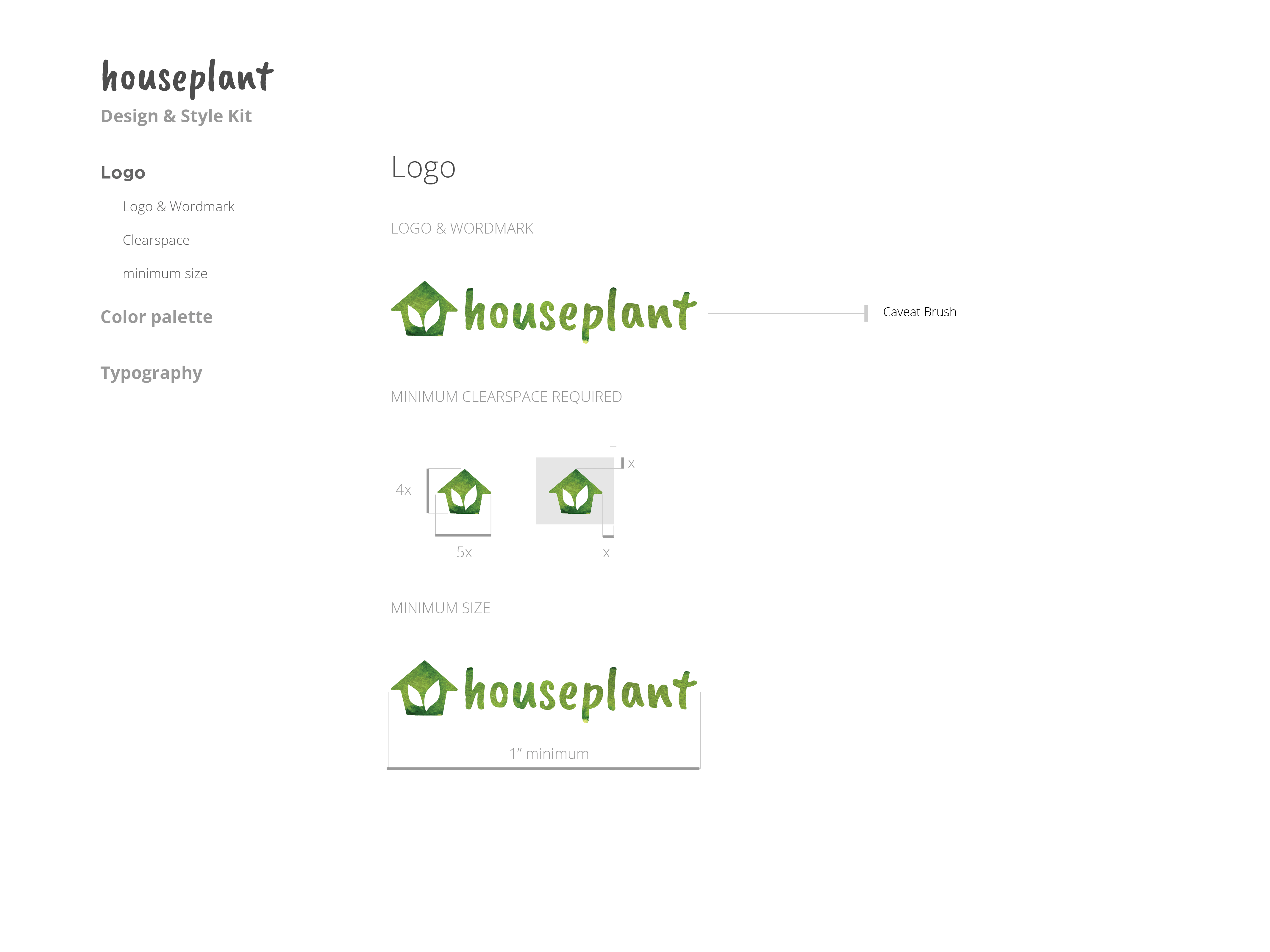
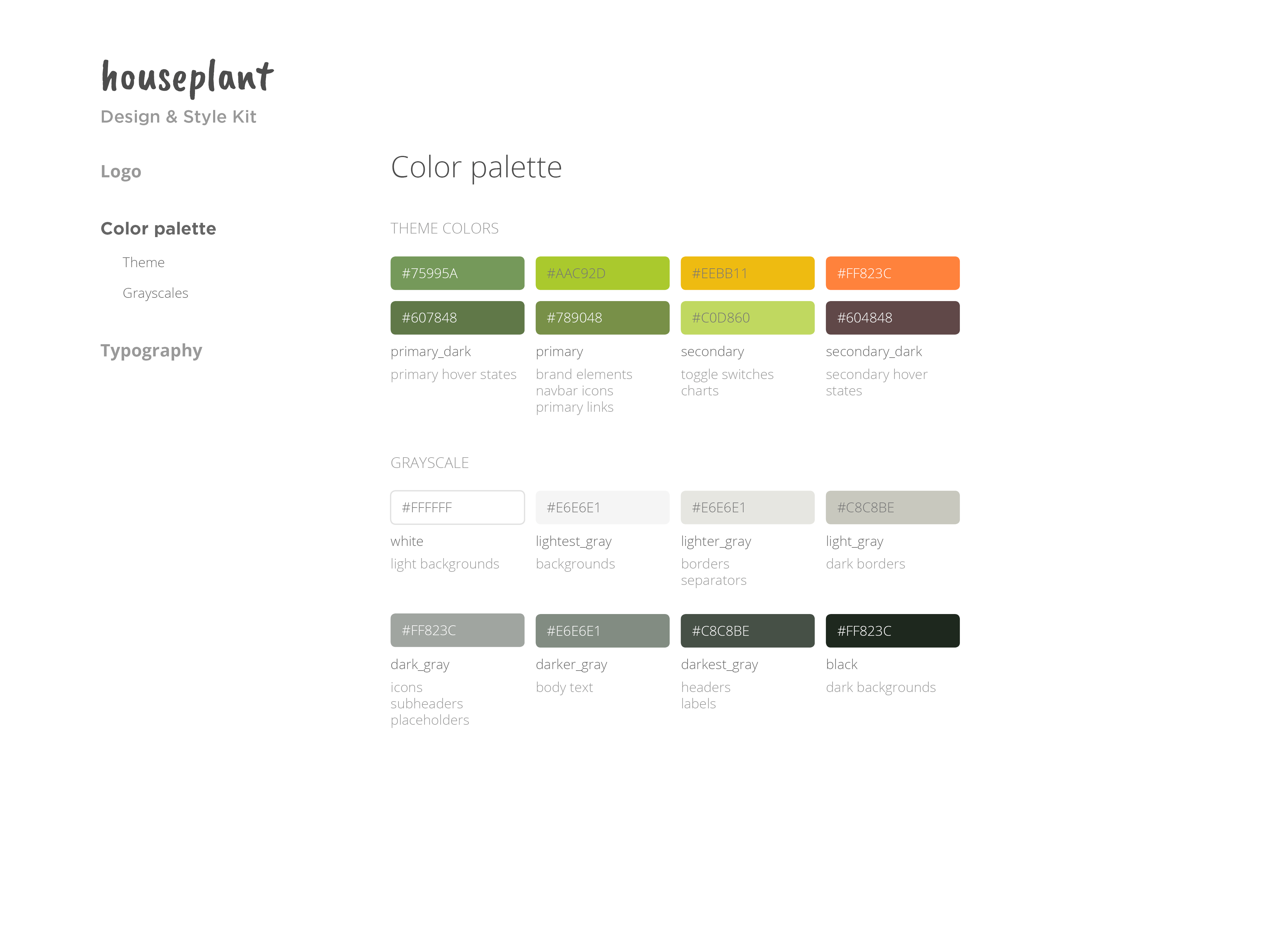
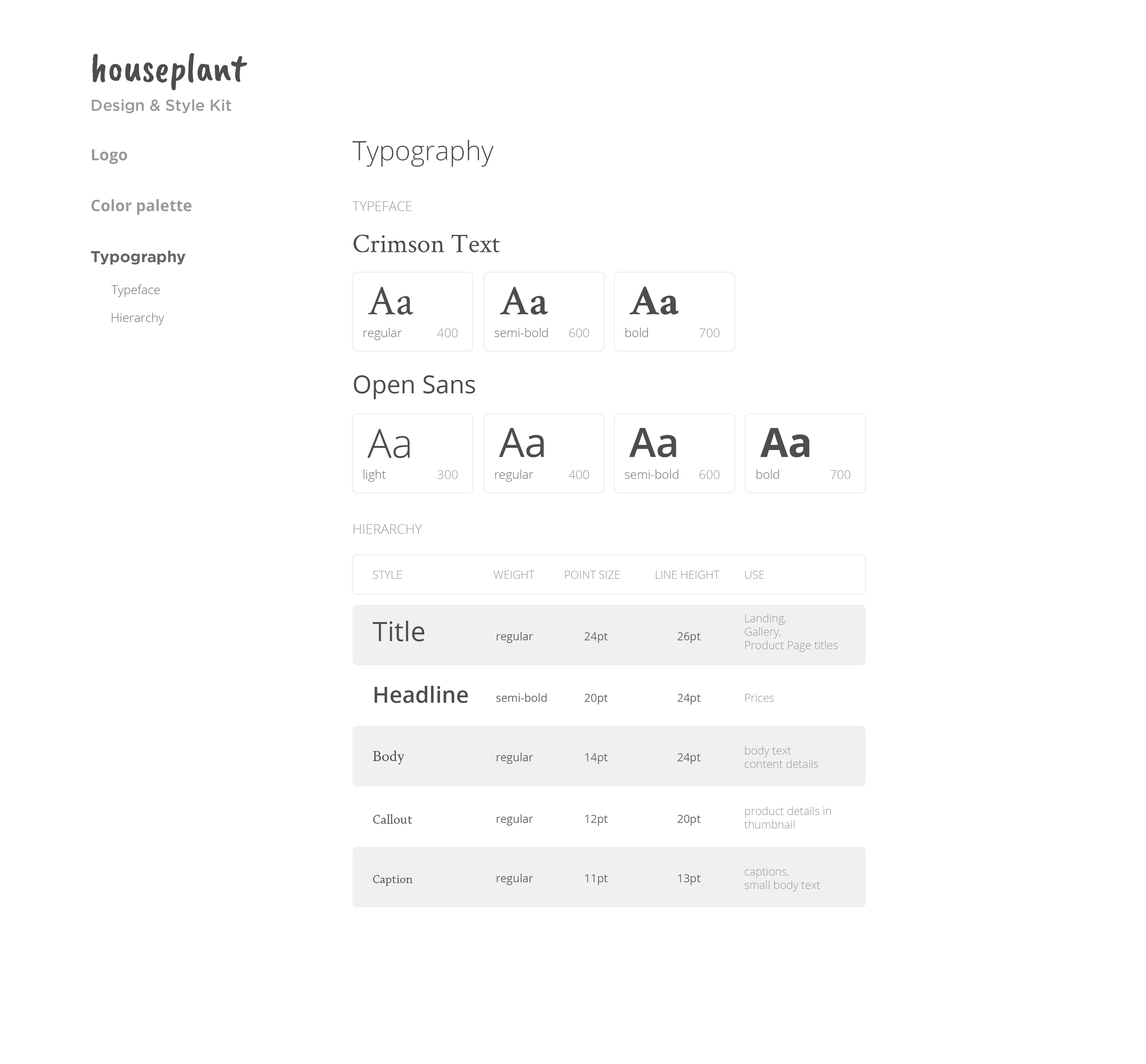
4. Prepping for Layout. Now that I had a few rough ideas of what houseplant could look like, I created a style guide to prepare for designing the layout later on. The style guide includes color palettes, font choices, and specifications for the logo. I ended up not using many of the colors and fonts depicted here. However, by referencing the guide, I had an easier time narrowing down visual options.
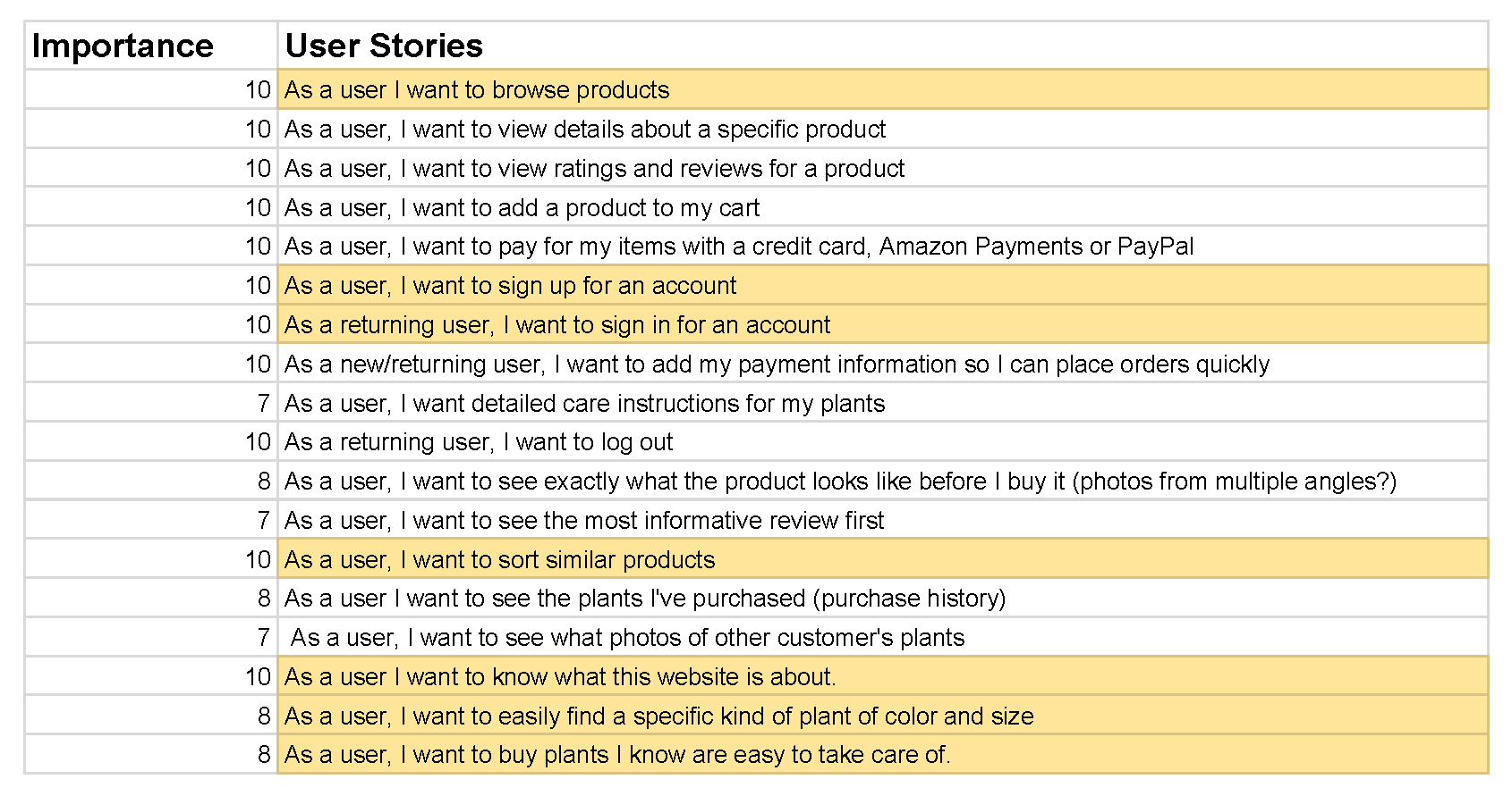
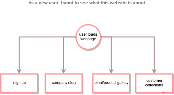
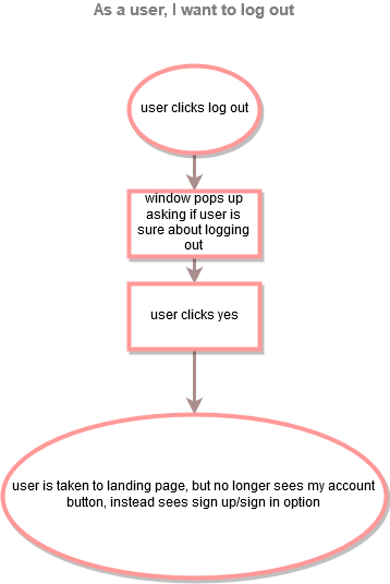
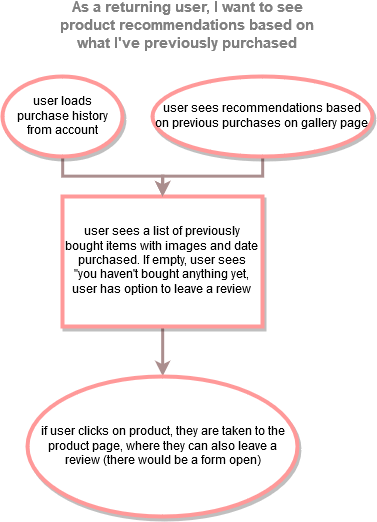
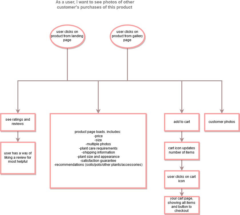
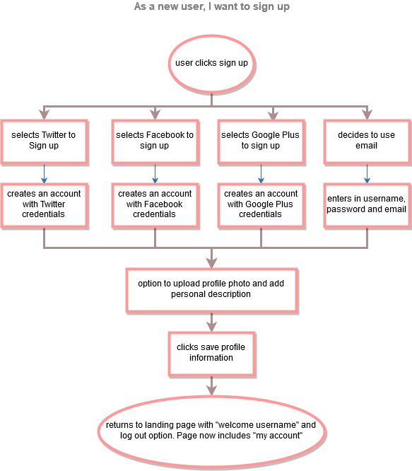
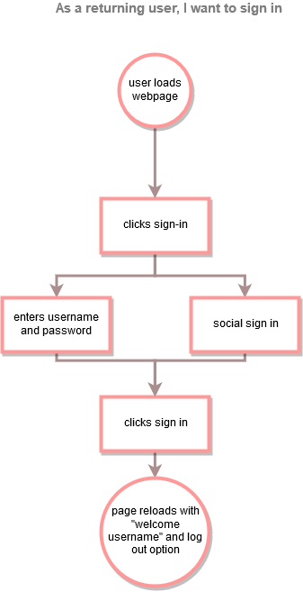
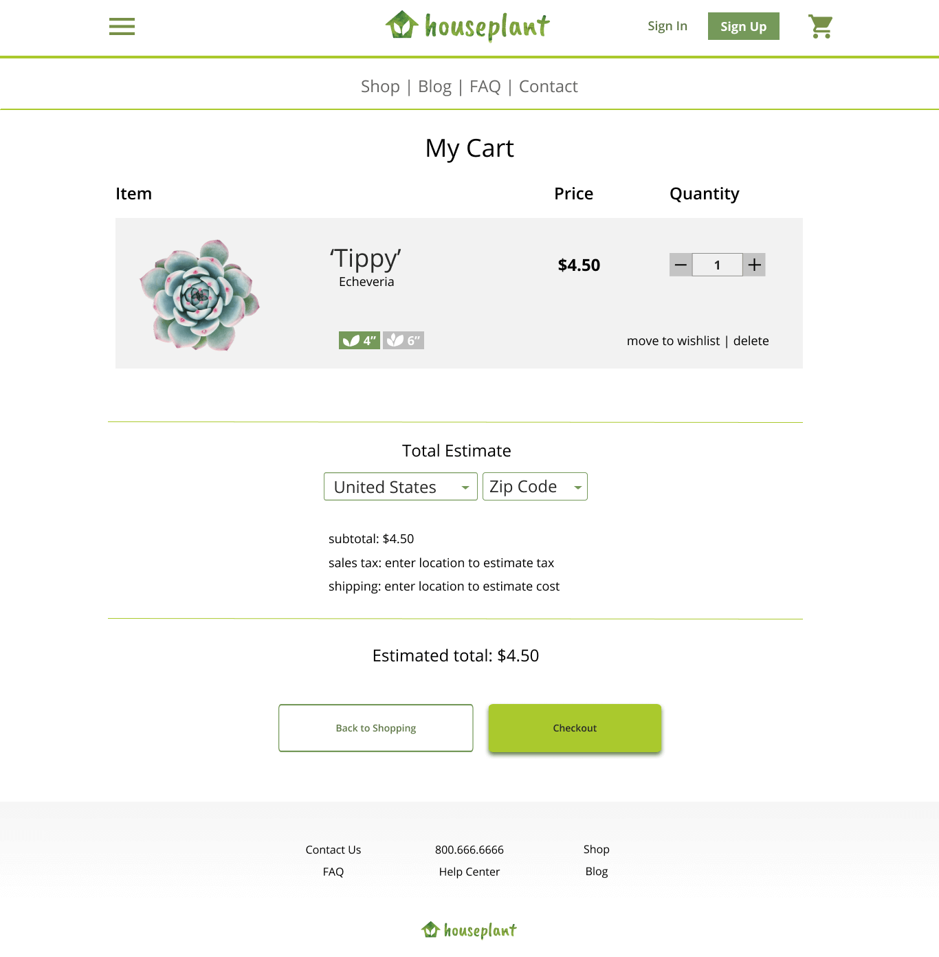
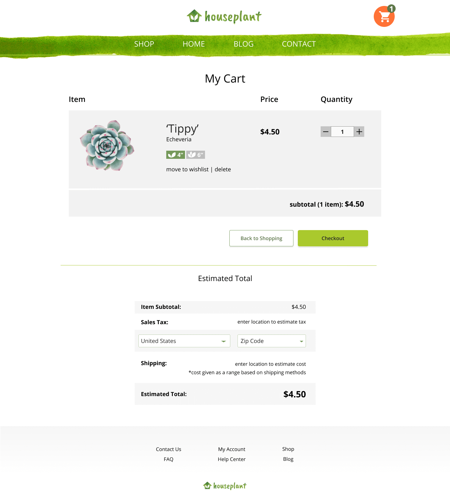
In order to set the goals for this project, I list all user stories and highlight those that are essential to a viable product. Since this is a shopping site, my MVP (minimum viable product) user stories focus on:
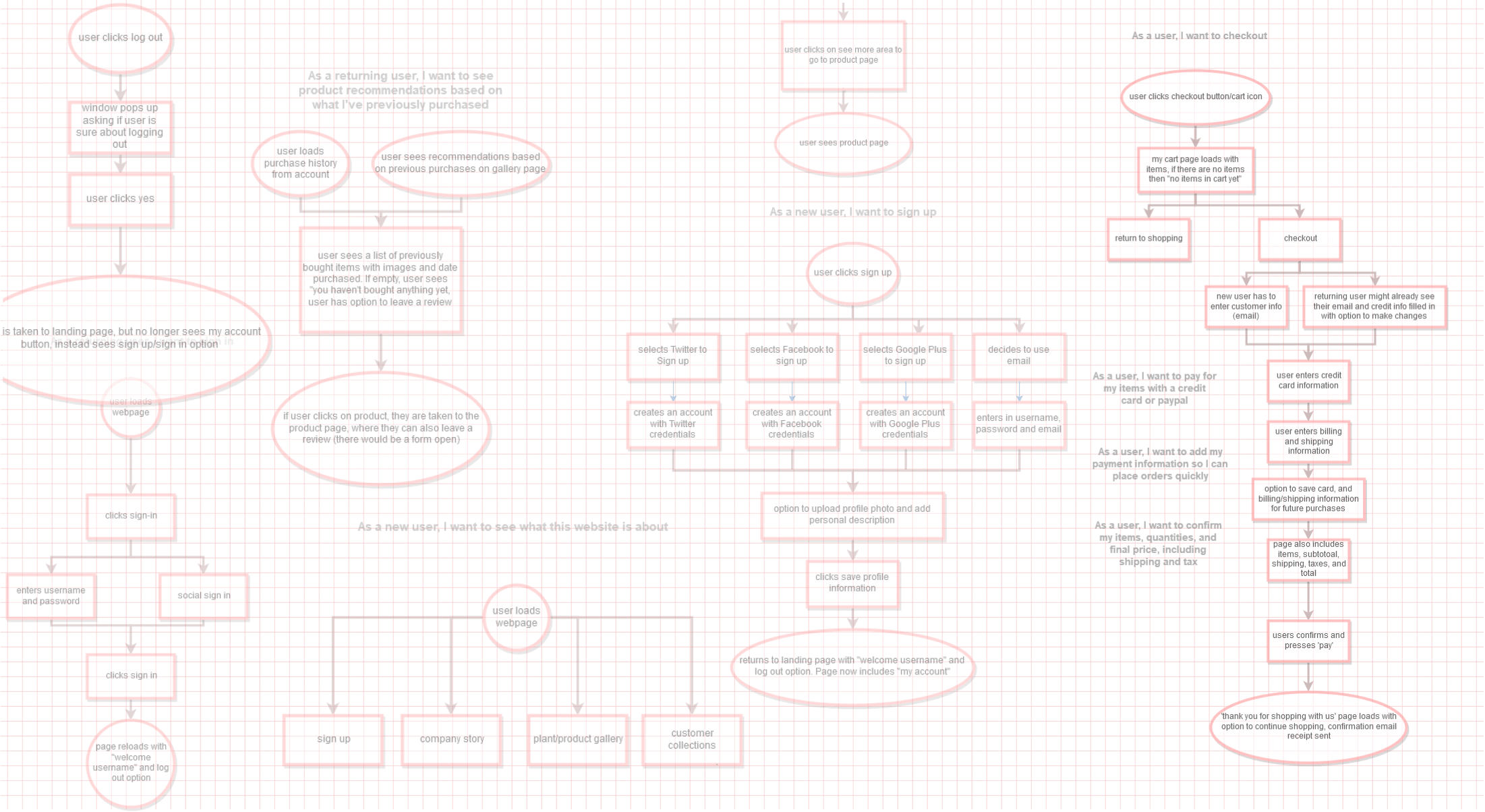
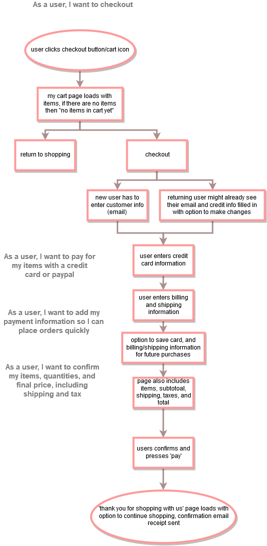
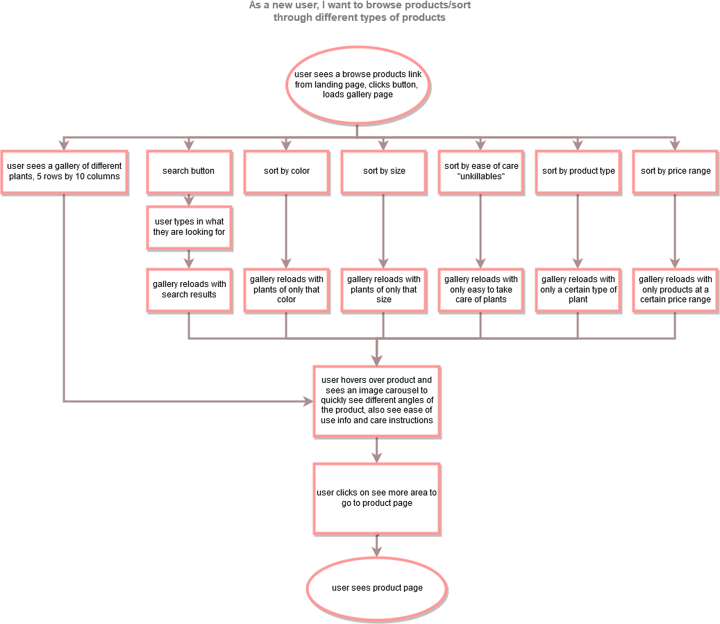
To understand the logic behind each user story, I create user flows that outline the steps needed for a user to complete a user story. While making user flows, I can focus on how to make relevant information quickly accessible.
The goal is for necessary processes, such as check-out, to be as quick and painless as possible, without forgetting about other needs.
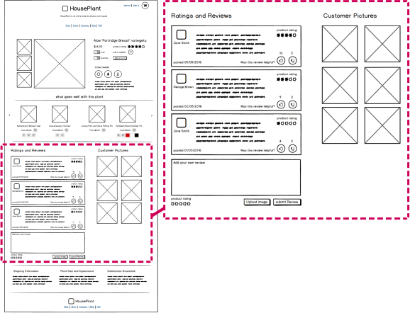
By using low fidelity wireframes, I could receive feedback earlier in the process, before becoming too invested in appearance.
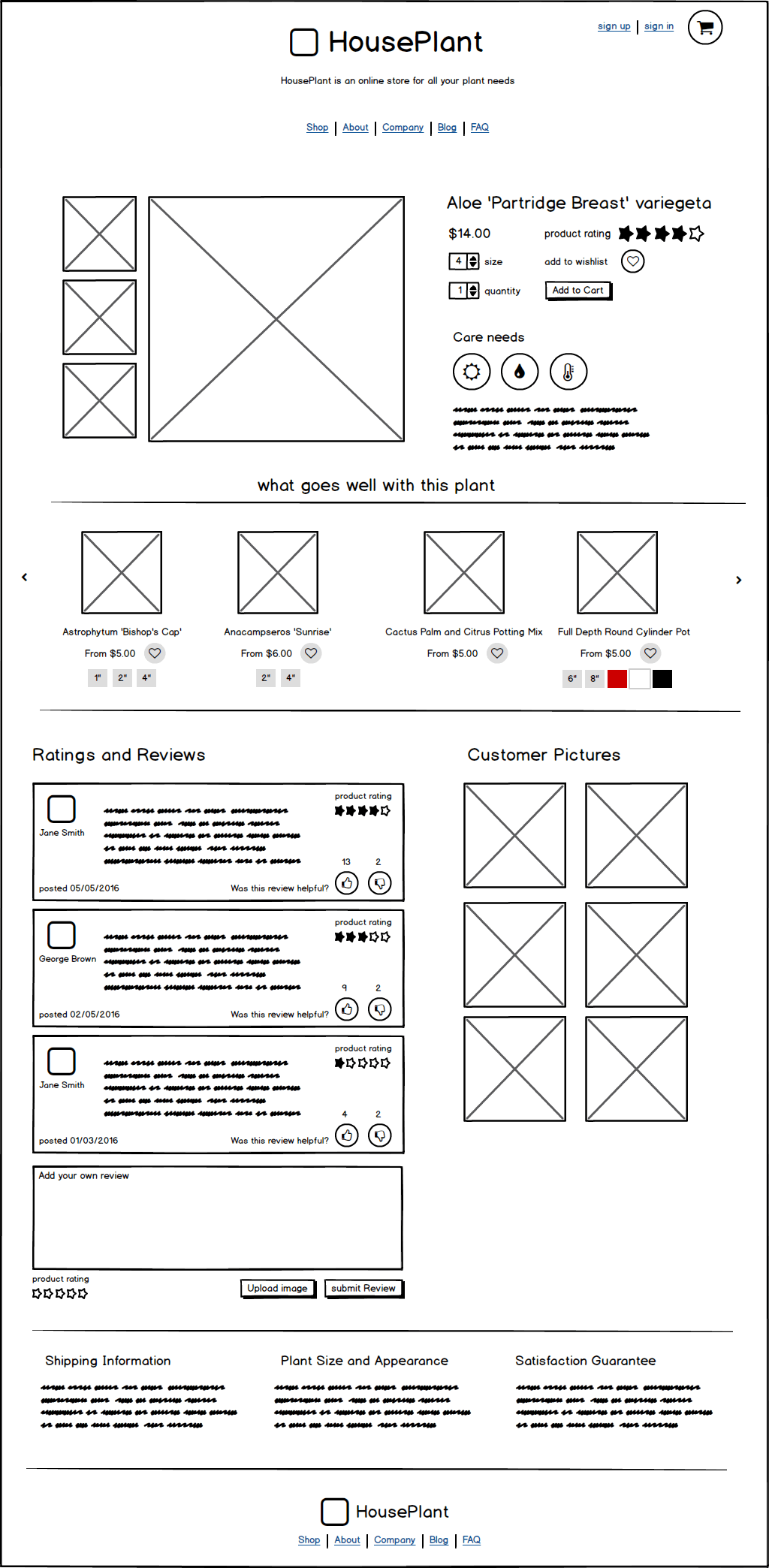
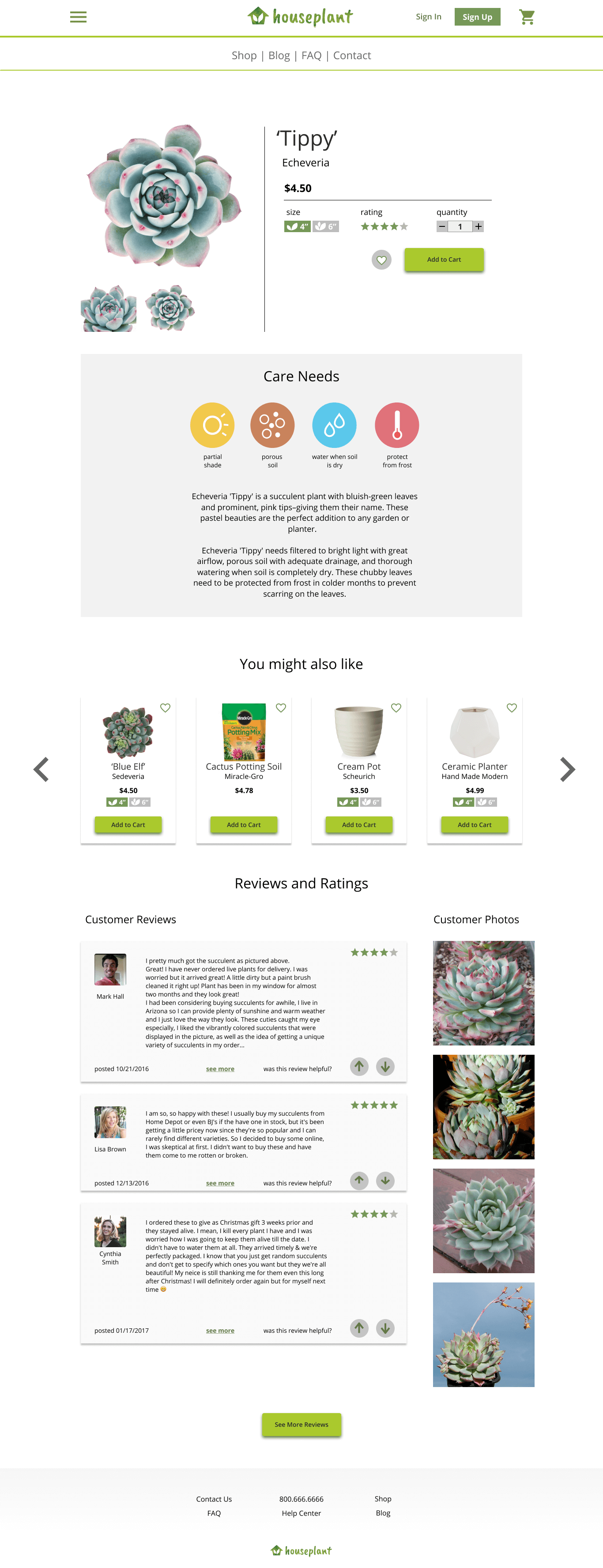
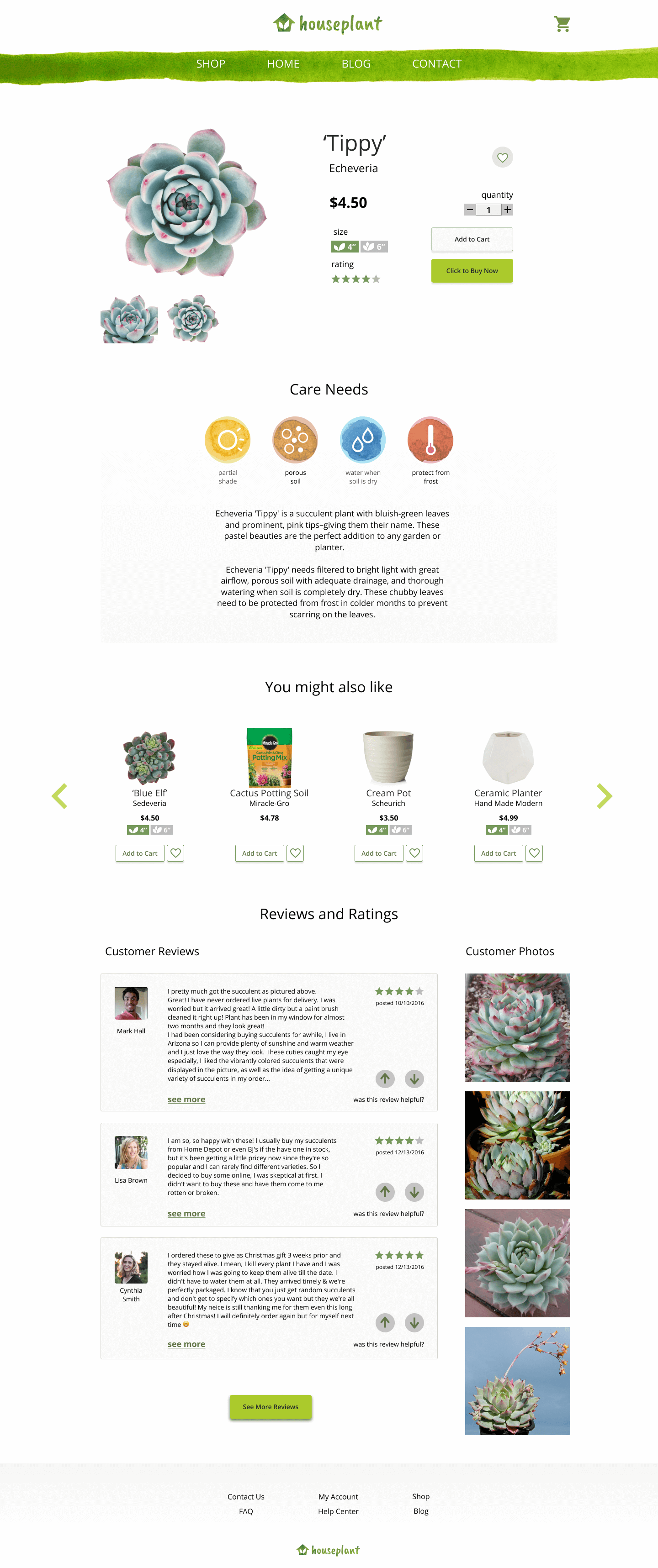
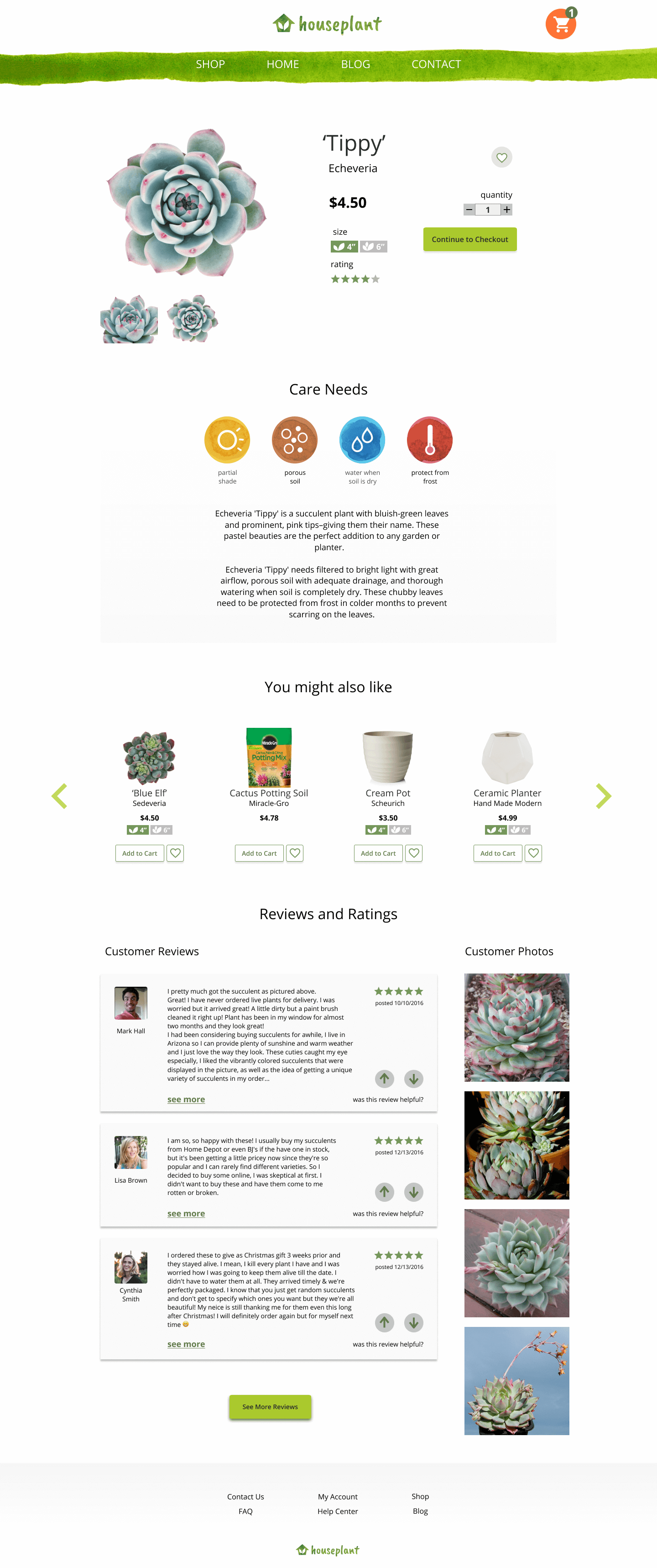
These wireframes incorporate content based on my research, including survey results and competitive analysis findings. For example, because 50% of my survey takers said that positive reviews are the most important purchasing factor, customer reviews and photos are included on the product page.
During usability tests, most users react positively to seeing the reviews in the low fidelity prototype.
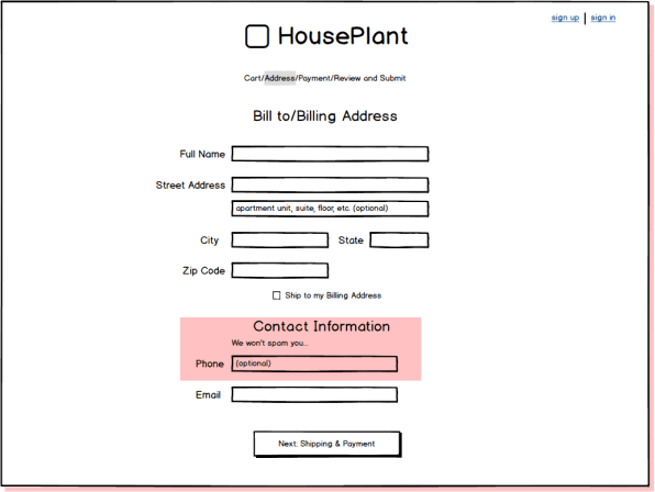
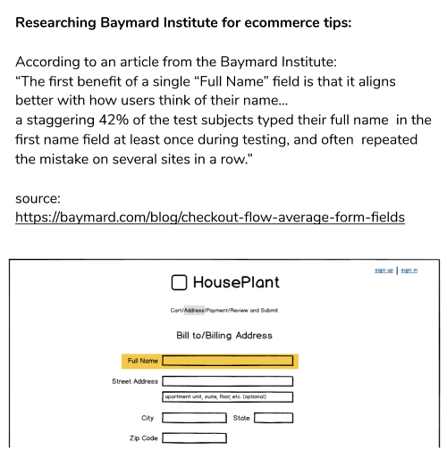
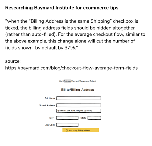
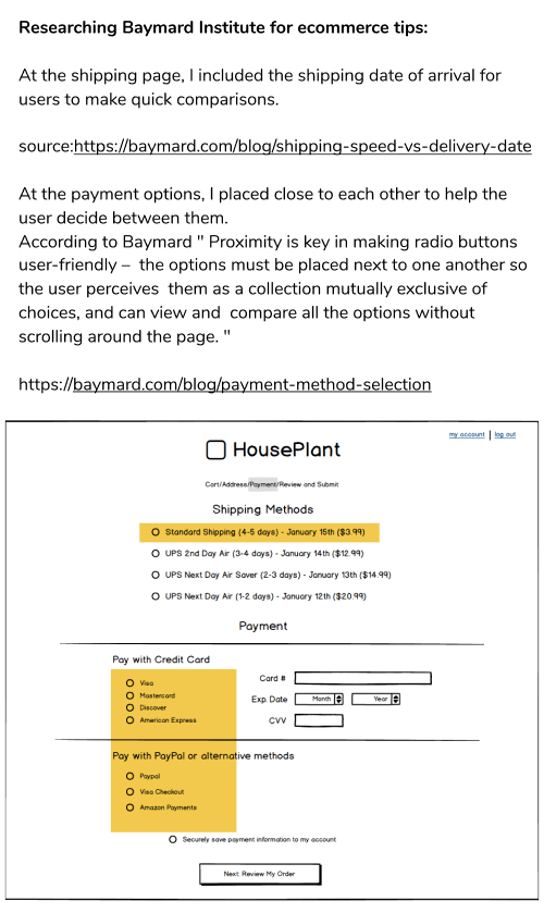
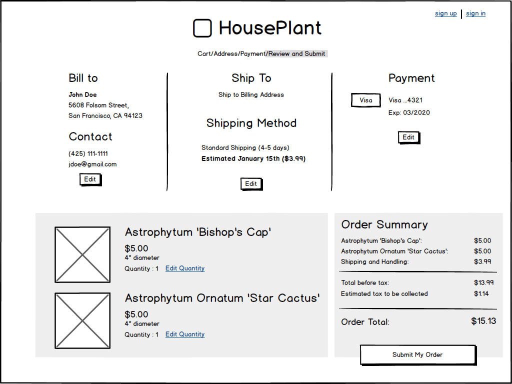
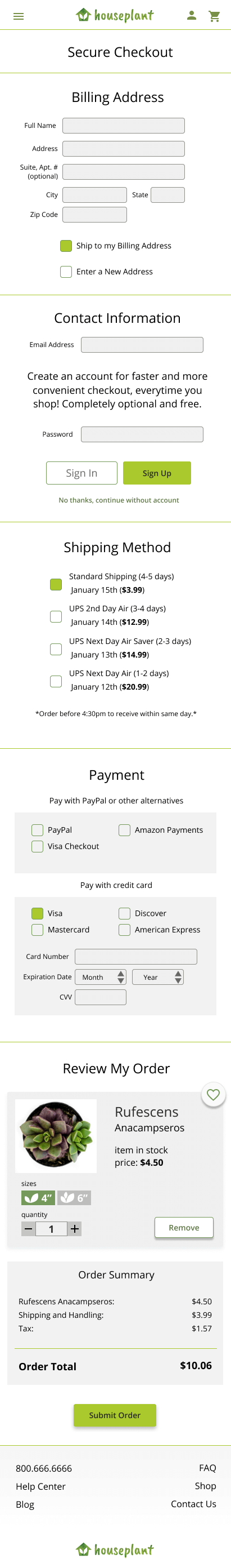
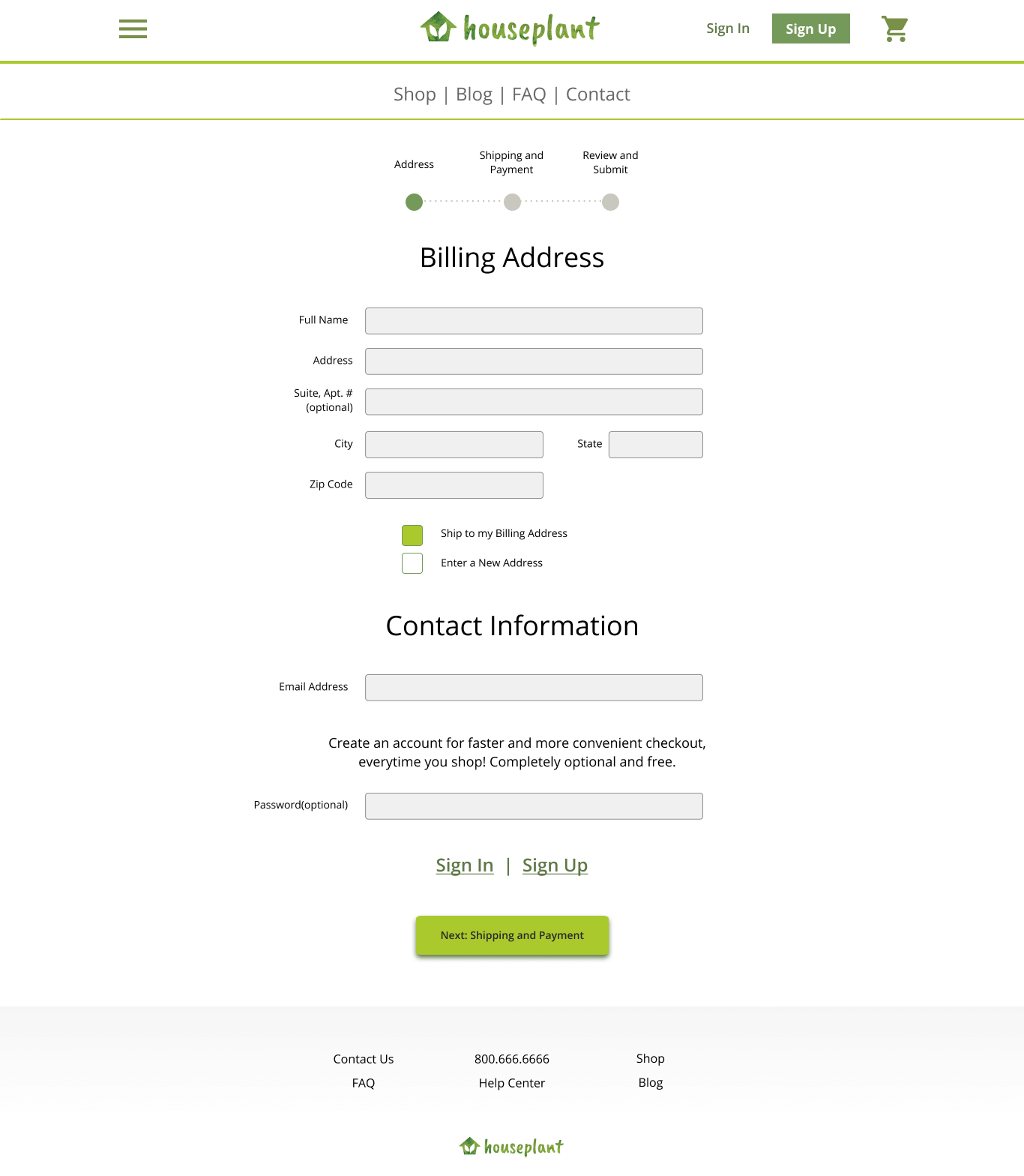
The Baymard Institute has a wealth of data on ecommerce design strategies. By referencing Baymard, I could make more informed design decisions.
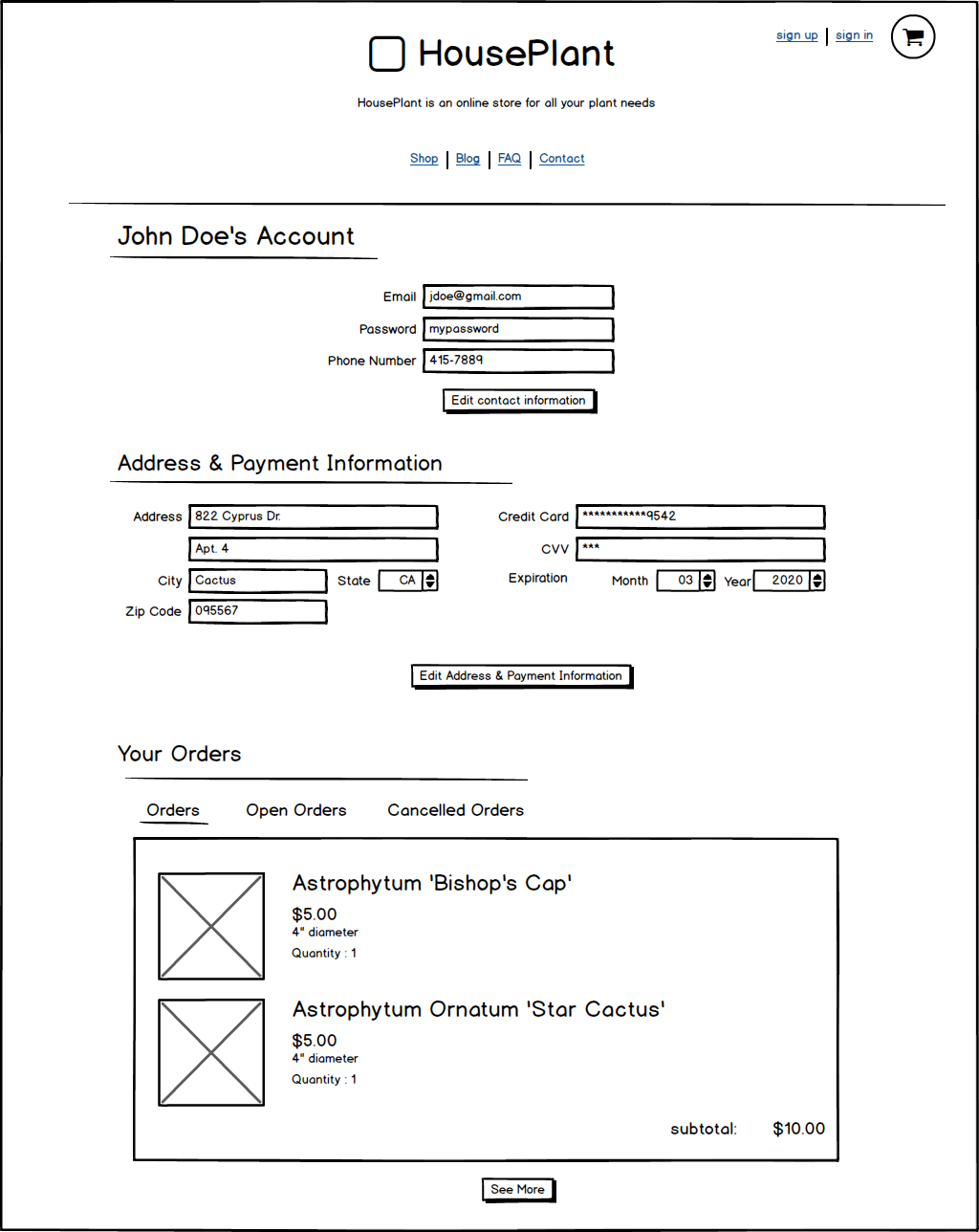
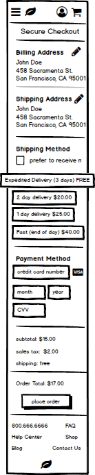
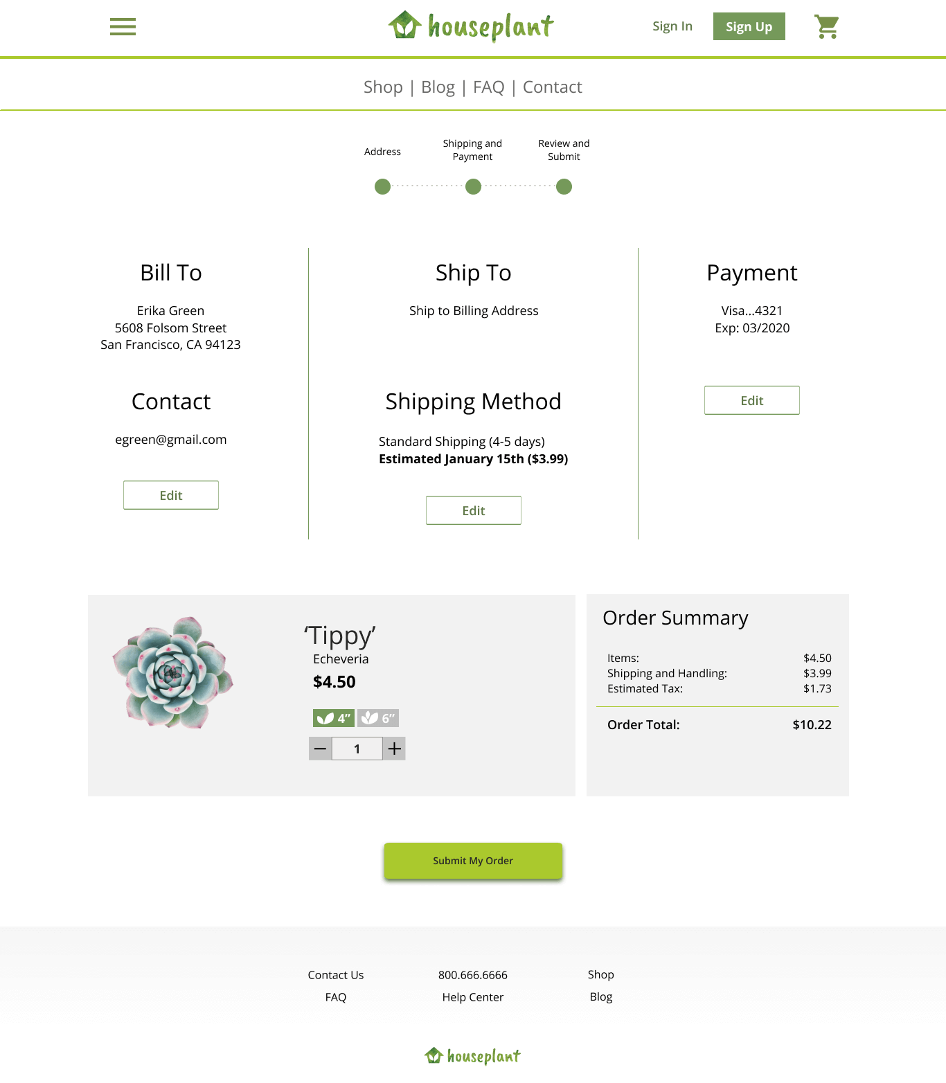
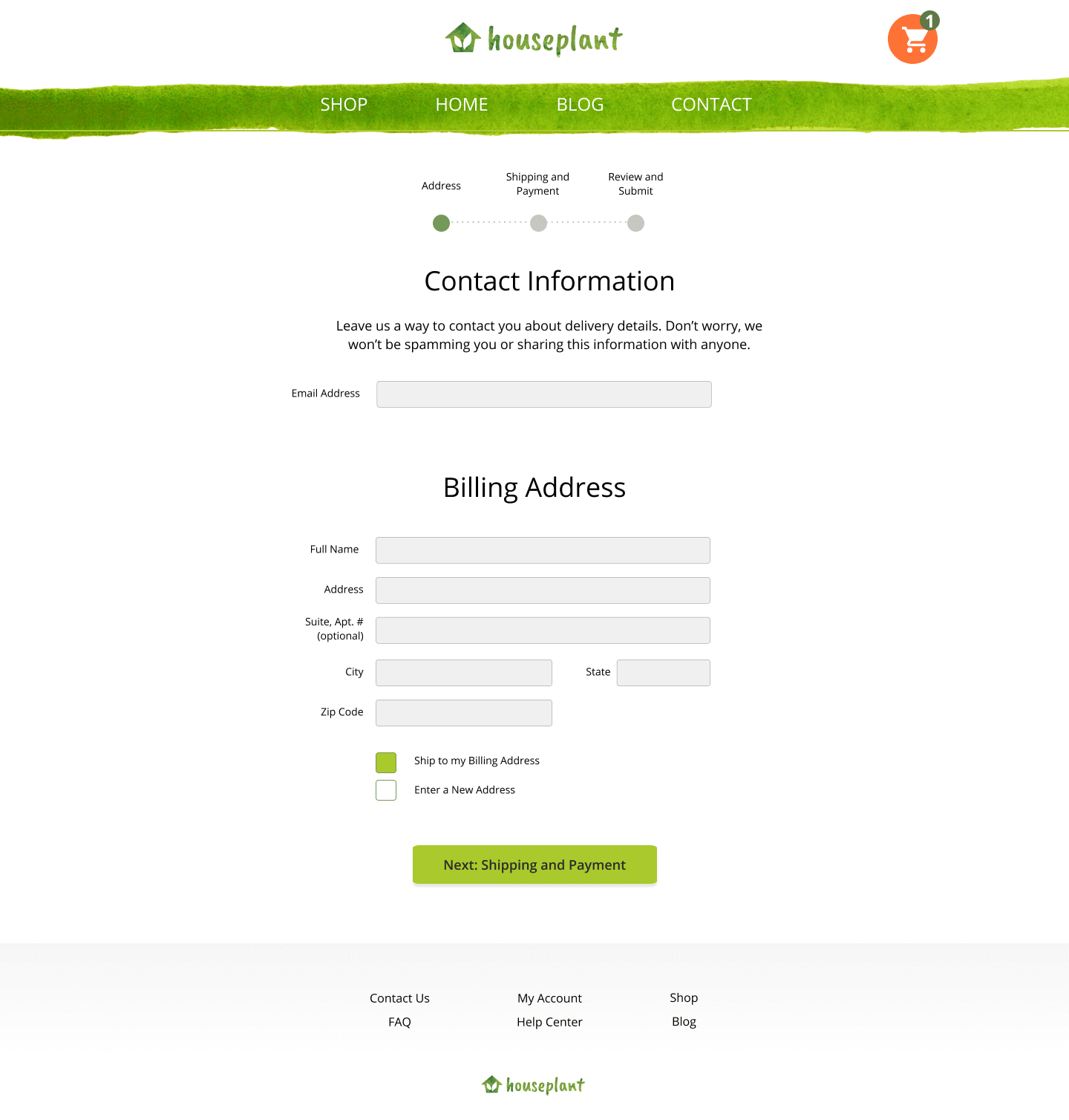
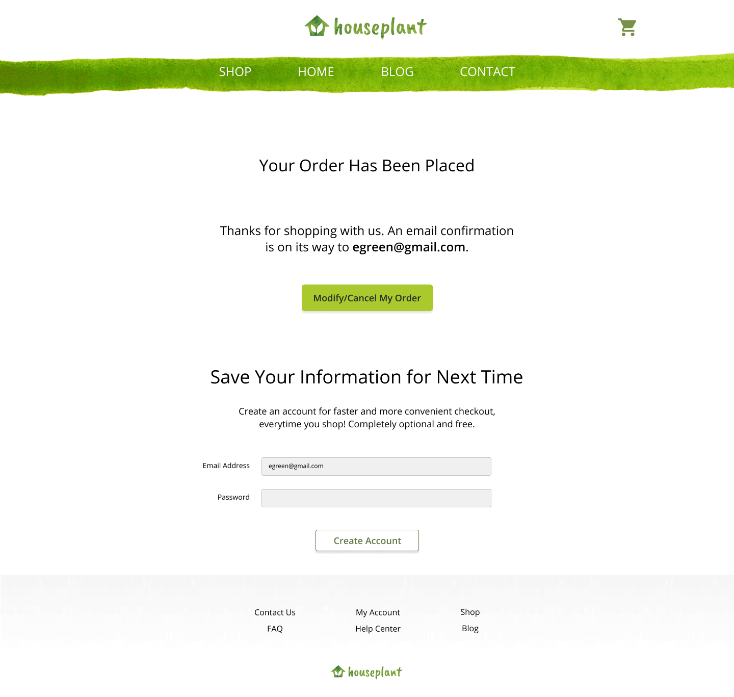
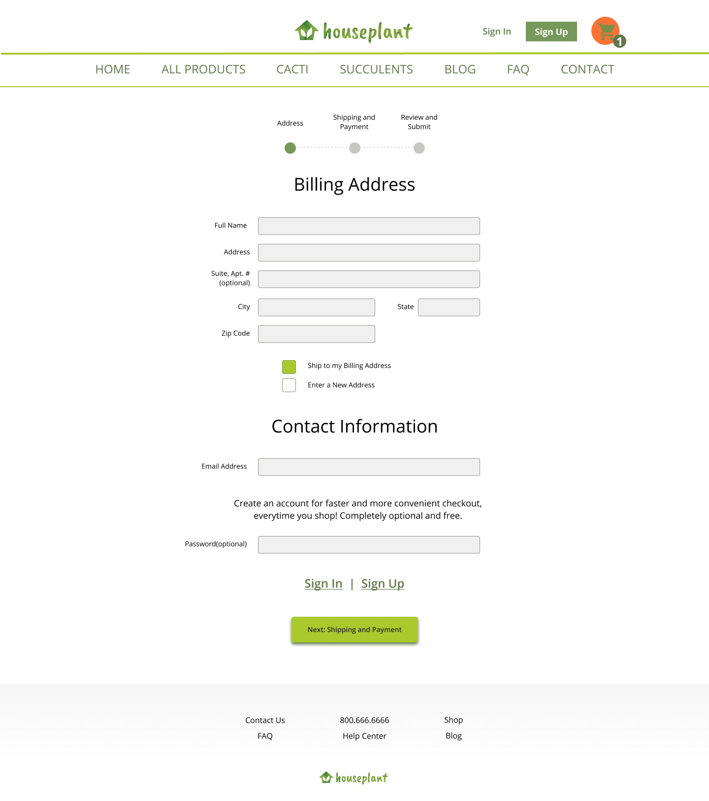
For example, on the billing information page, I include a text description explaining why houseplant is asking for contact information. According to this Baymard research article, when sites include an explanation, users are more comfortable with providing their contact information.
Users from my usability interview expressed that seeing this explanation made them more assured when inputting their email address and less likely to leave the site.
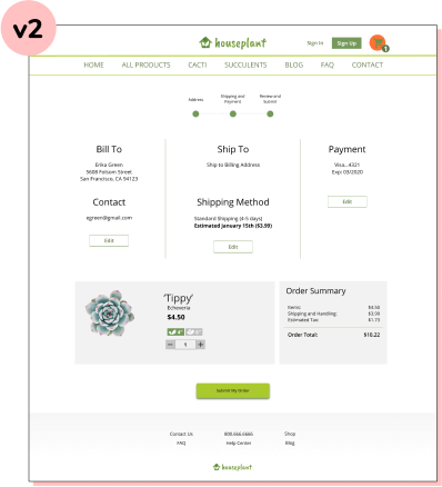
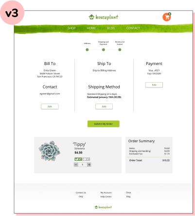
The image shows the 'contact' description highlighted in pink.
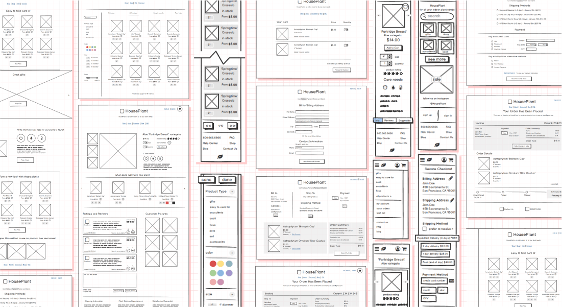
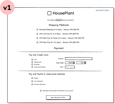
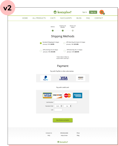
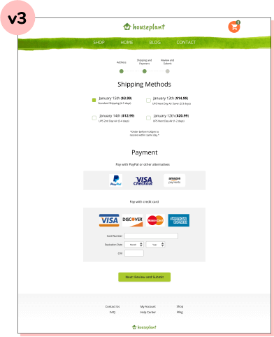
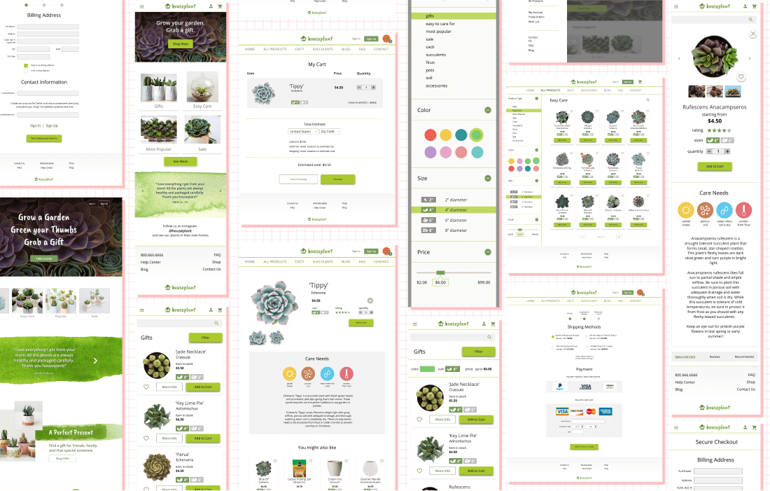
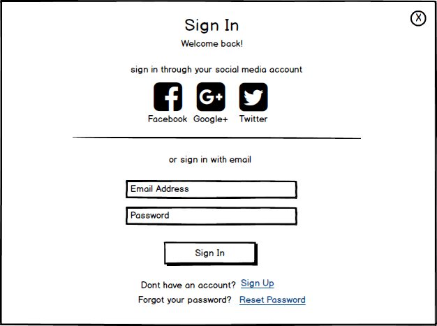
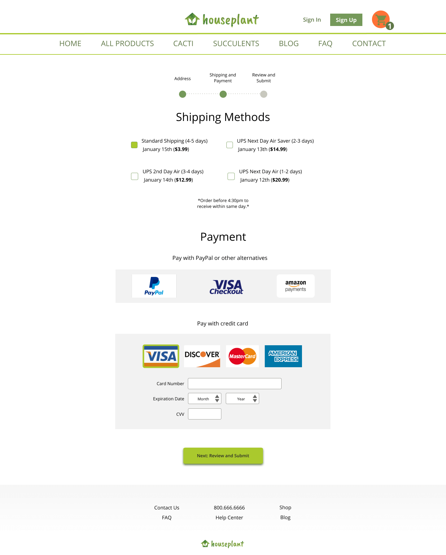
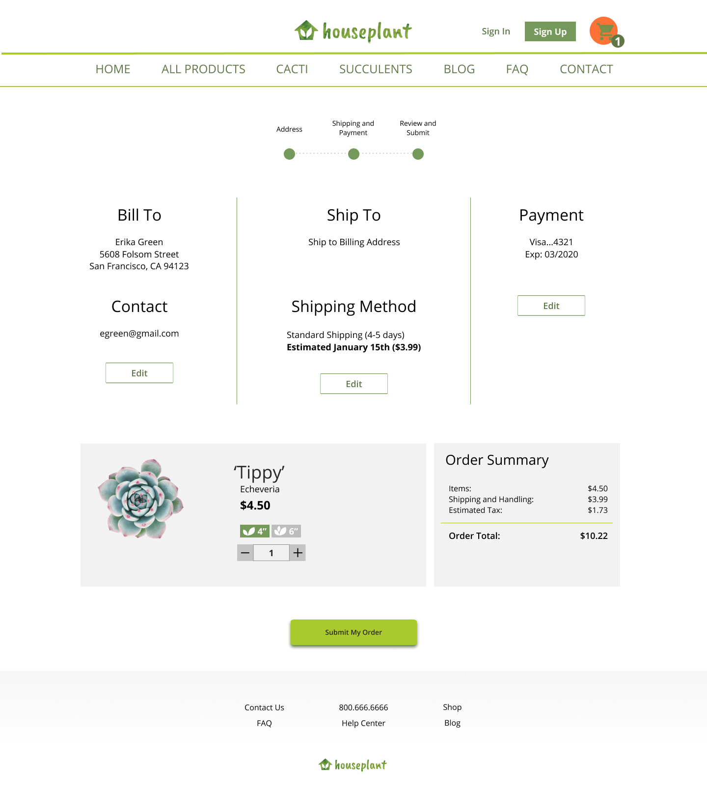
I approached high fidelity wireframes by taking the content and layout of the low fidelity wireframes and dressing them up with the colors, graphic style, and typography developed previously. While designing visuals, I would often ask people around me for thoughts and opinions. If I got stuck between a few options, I would conduct a preference test to get feedback from a larger group of people.
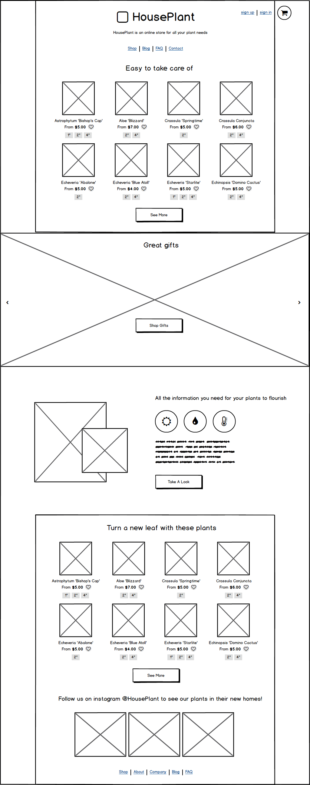
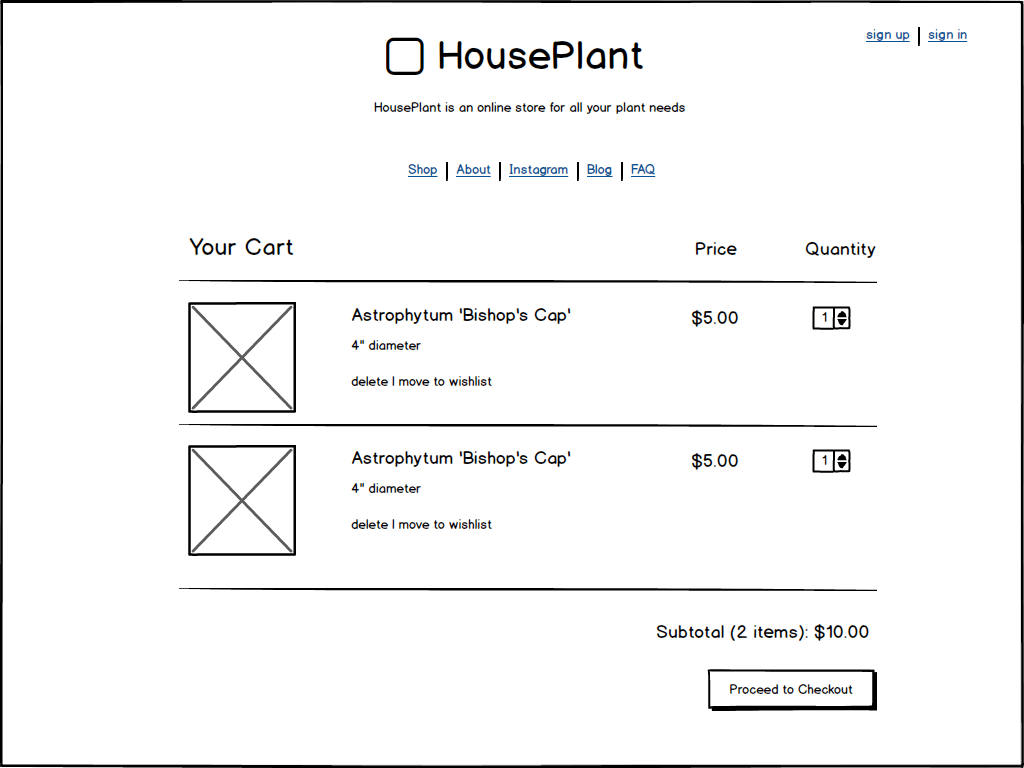
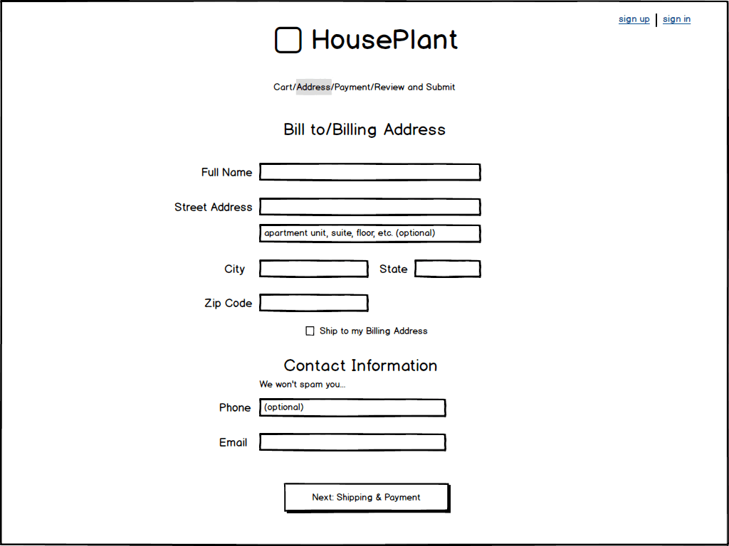
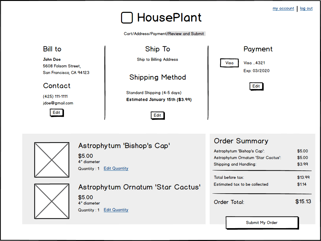
The images below show the progression from low fidelity to high fidelity.
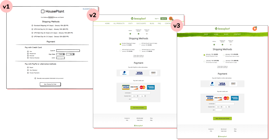
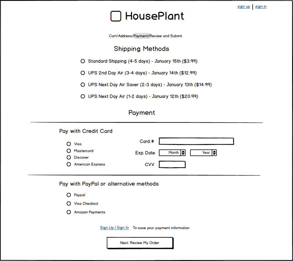
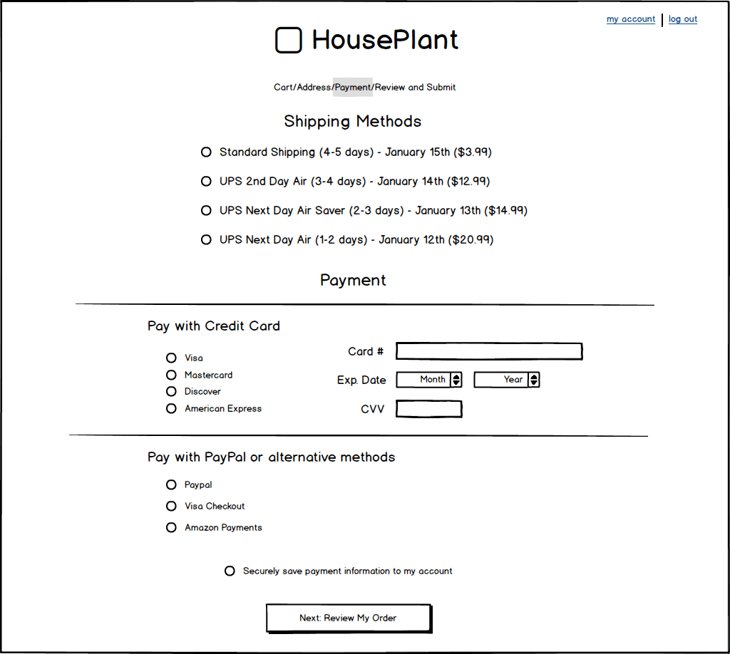
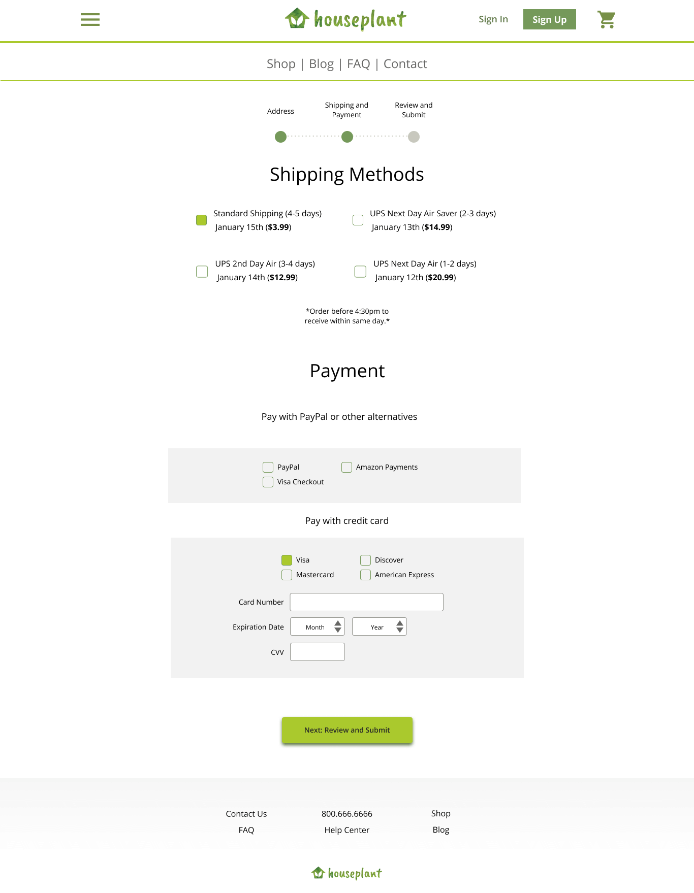
shipping/payment page iterations
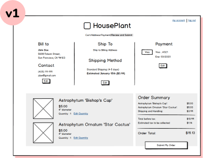
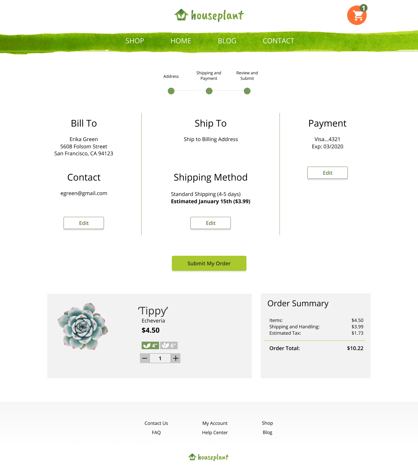
review/submit page iterations
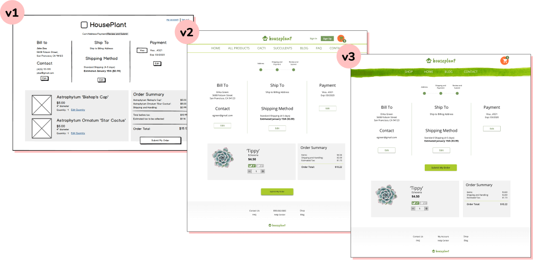
After assembling all the images and implementing color and font, I tested the high fidelity wireframes to see if there were any issues. By testing, I realized that the wireframes had issues with hierarchy and focus.
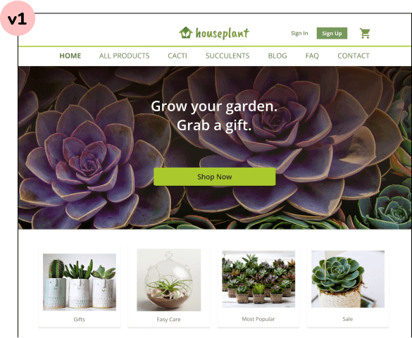
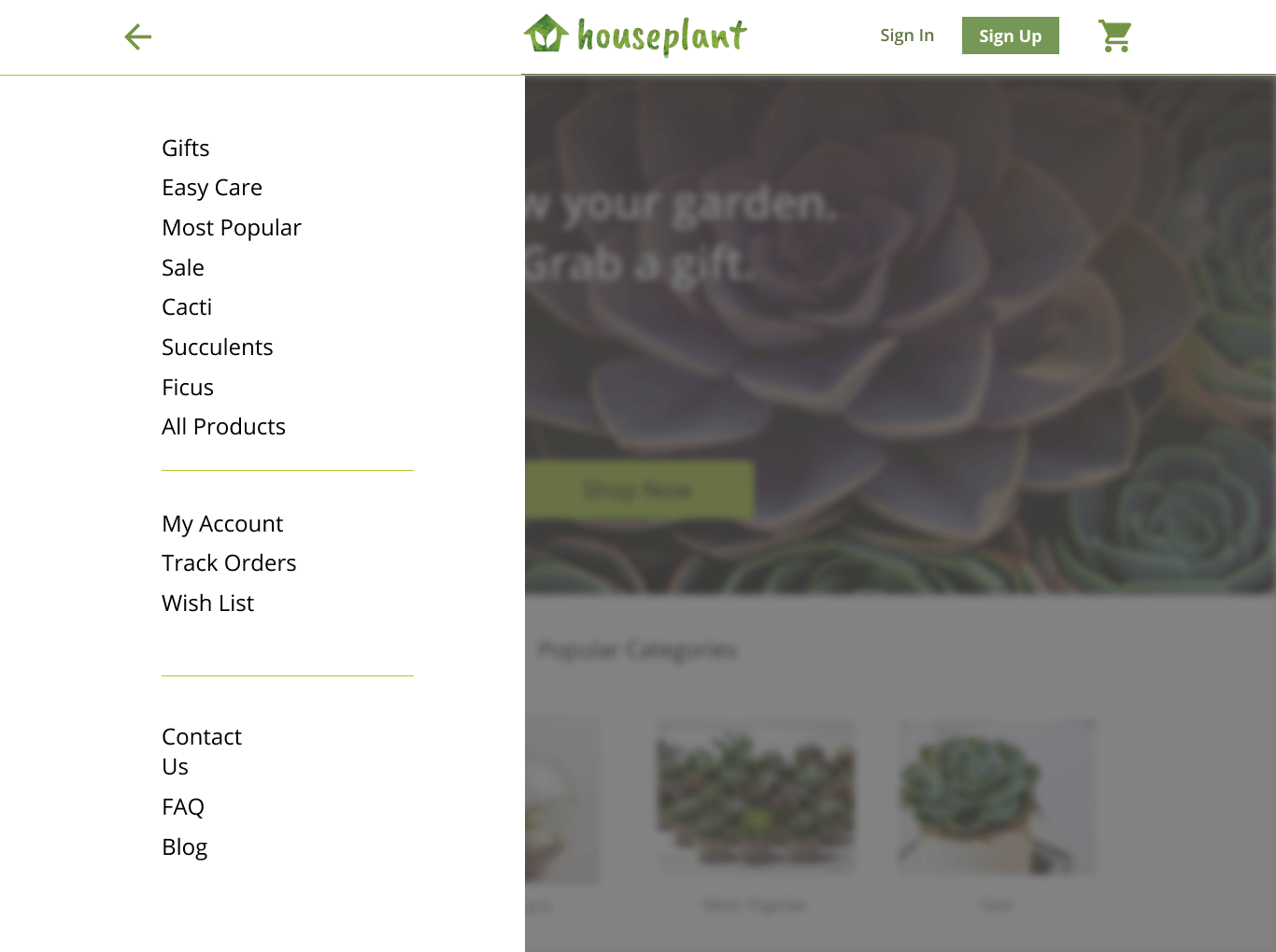
For example, when viewing the landing page, users mentioned that the site menu was too distracting.
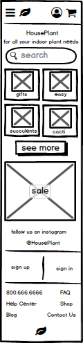
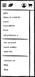
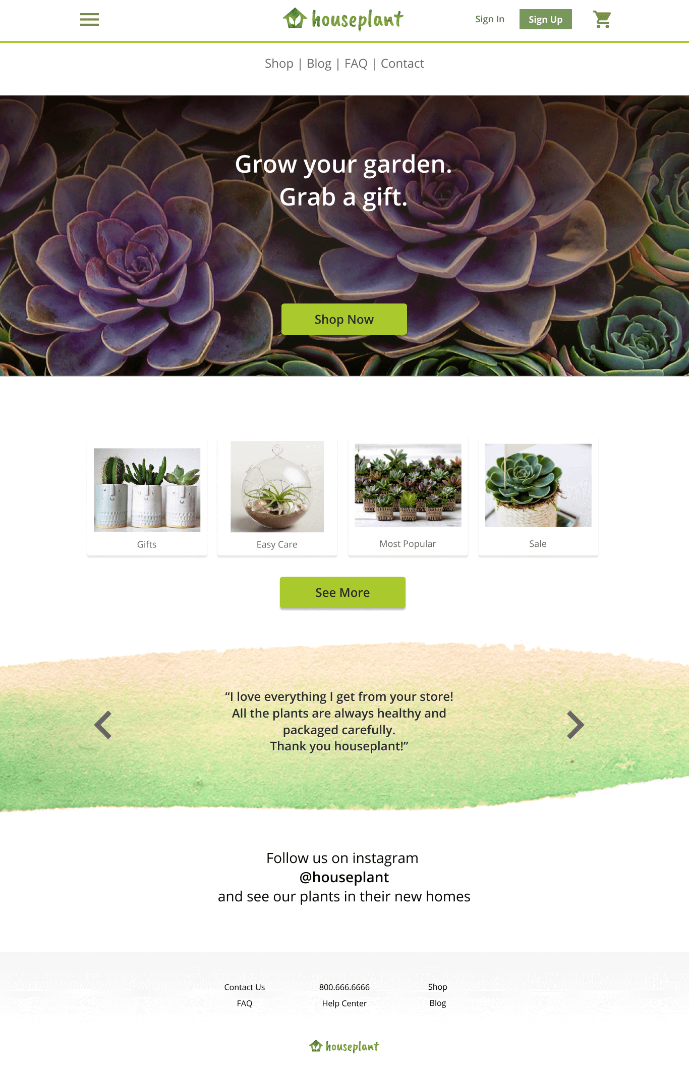
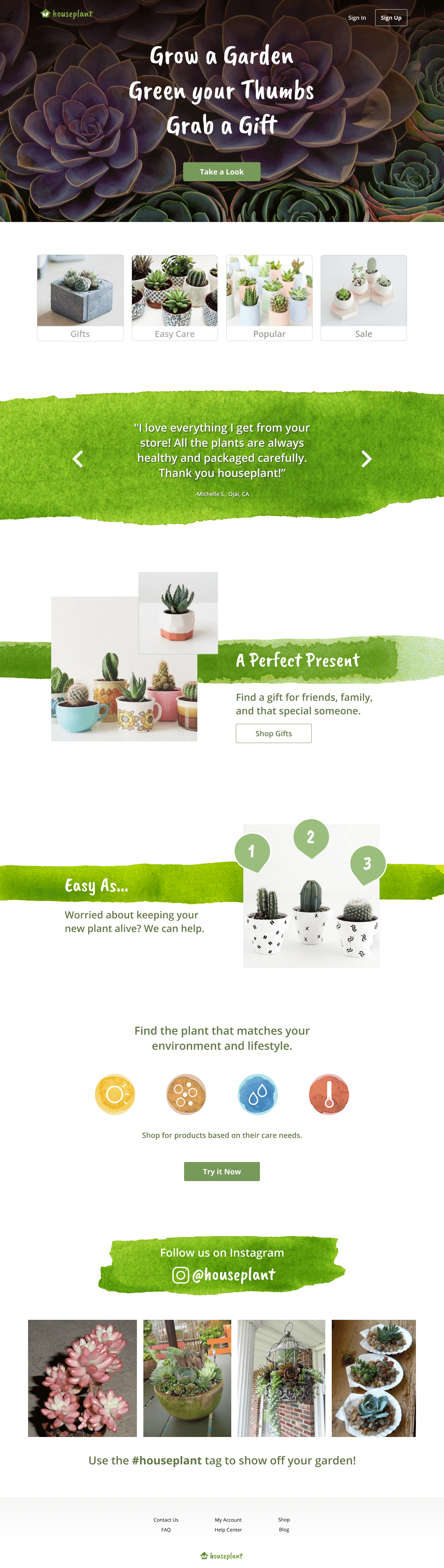
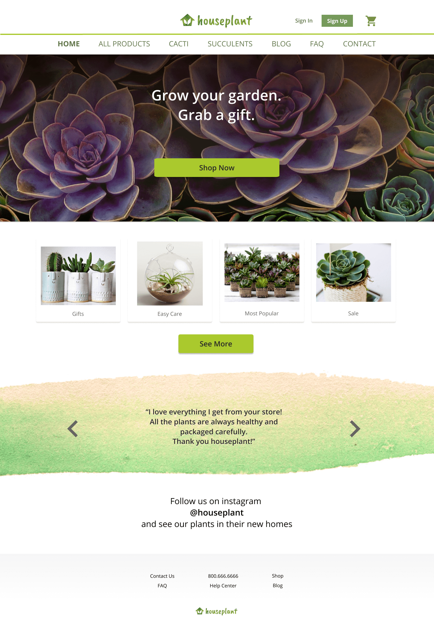
My goal on this page was to direct attention towards the 'Take A Look' button. This button would then take users to the shopping gallery where they could browse through products. To better funnel users towards the shopping section of the site, I did two things. I removed the site menu and lowered the contrast on the 'sign in/sign up' button. This minimized distraction, making it easier to focus on the 'Take a Look' button.
Version 1
The site menu had too many options and was overwhelming for some of my interviewees.
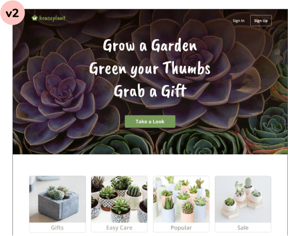
Version 2
With the site menu removed, the focus is now on the tagline and the call to action button below it. Clicking the button then takes the user to the gallery page where they can begin shopping.
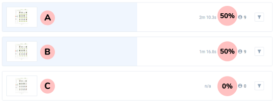
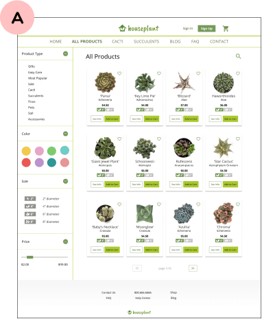
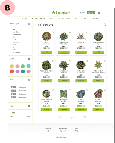
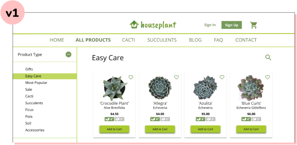
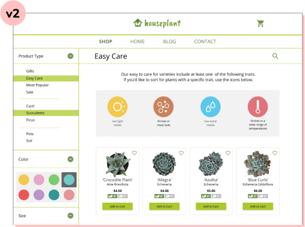
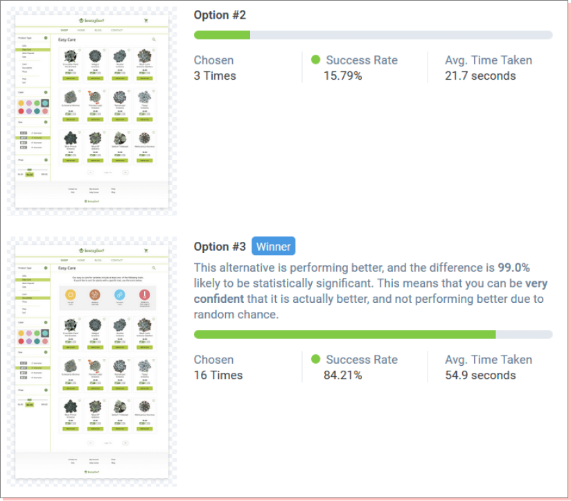
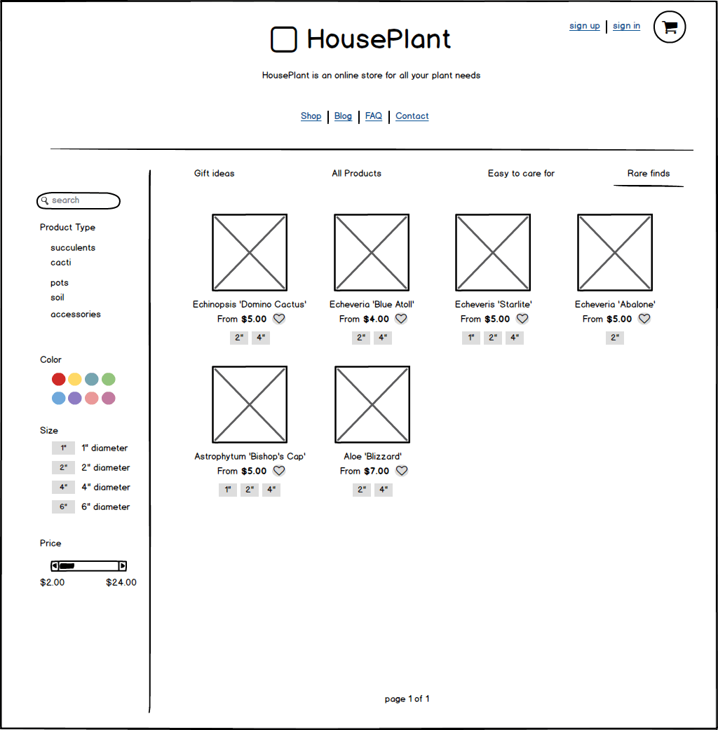
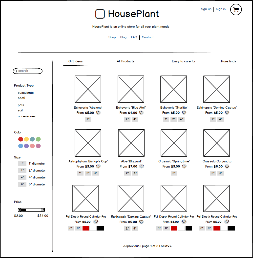
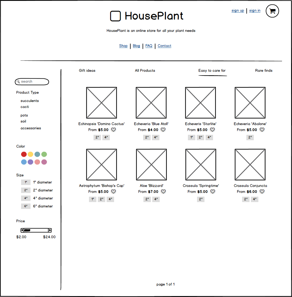
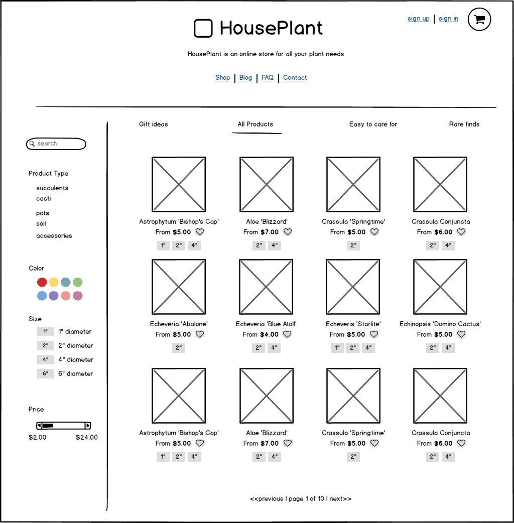
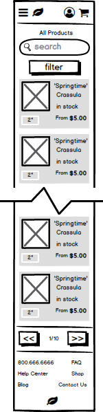
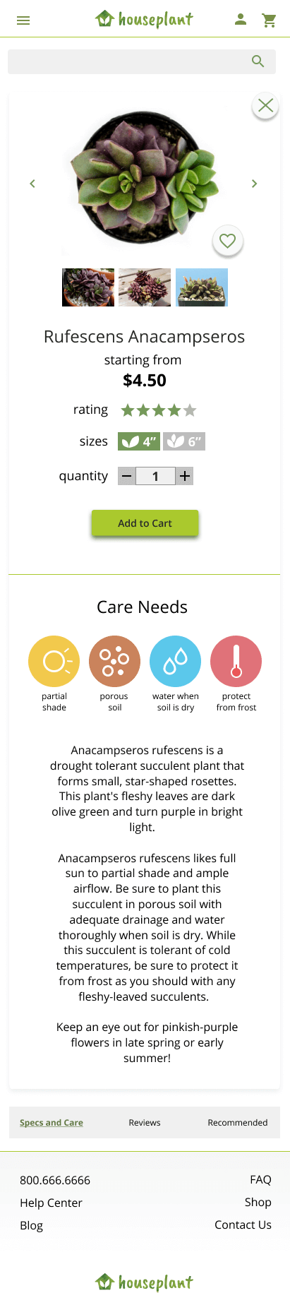
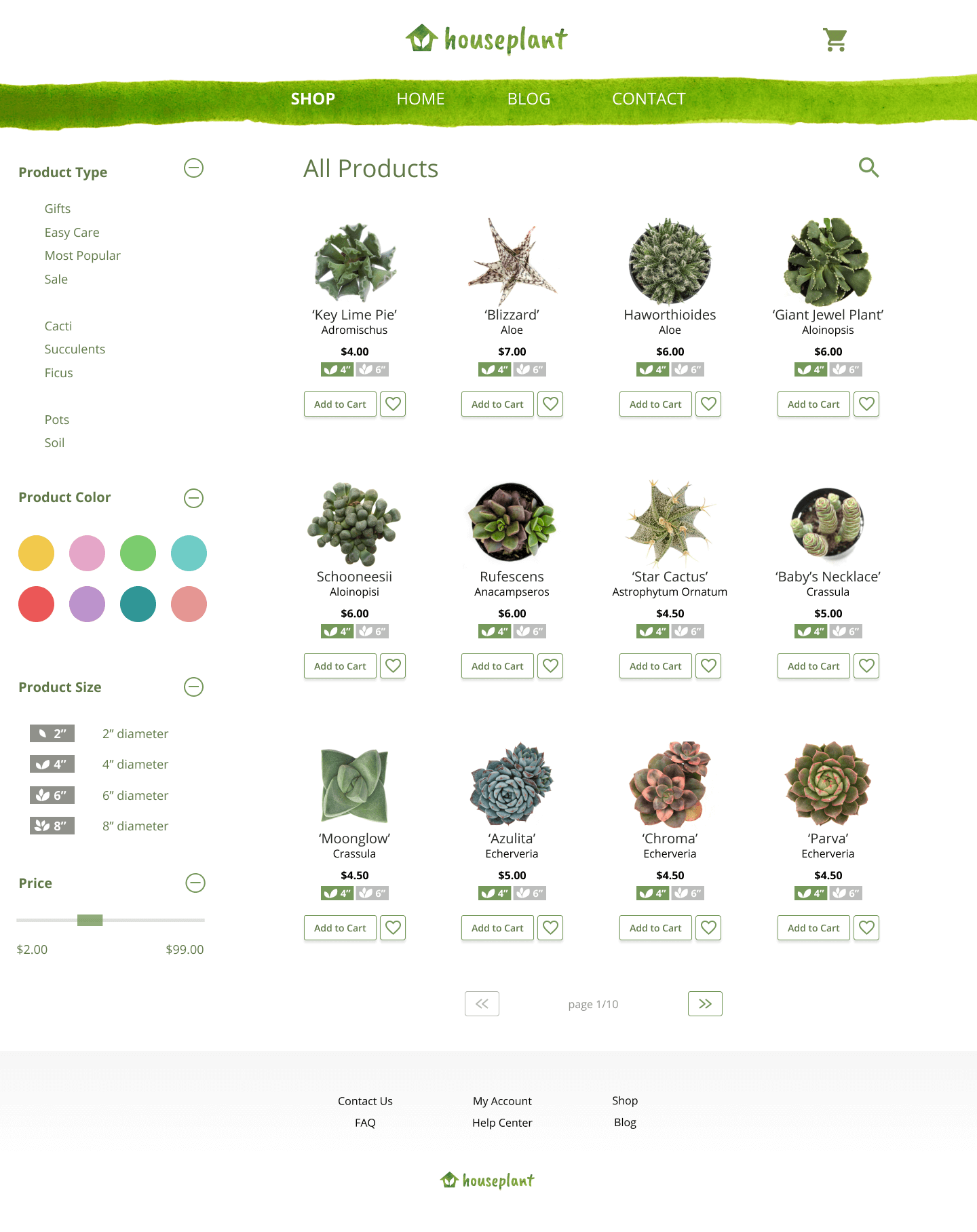
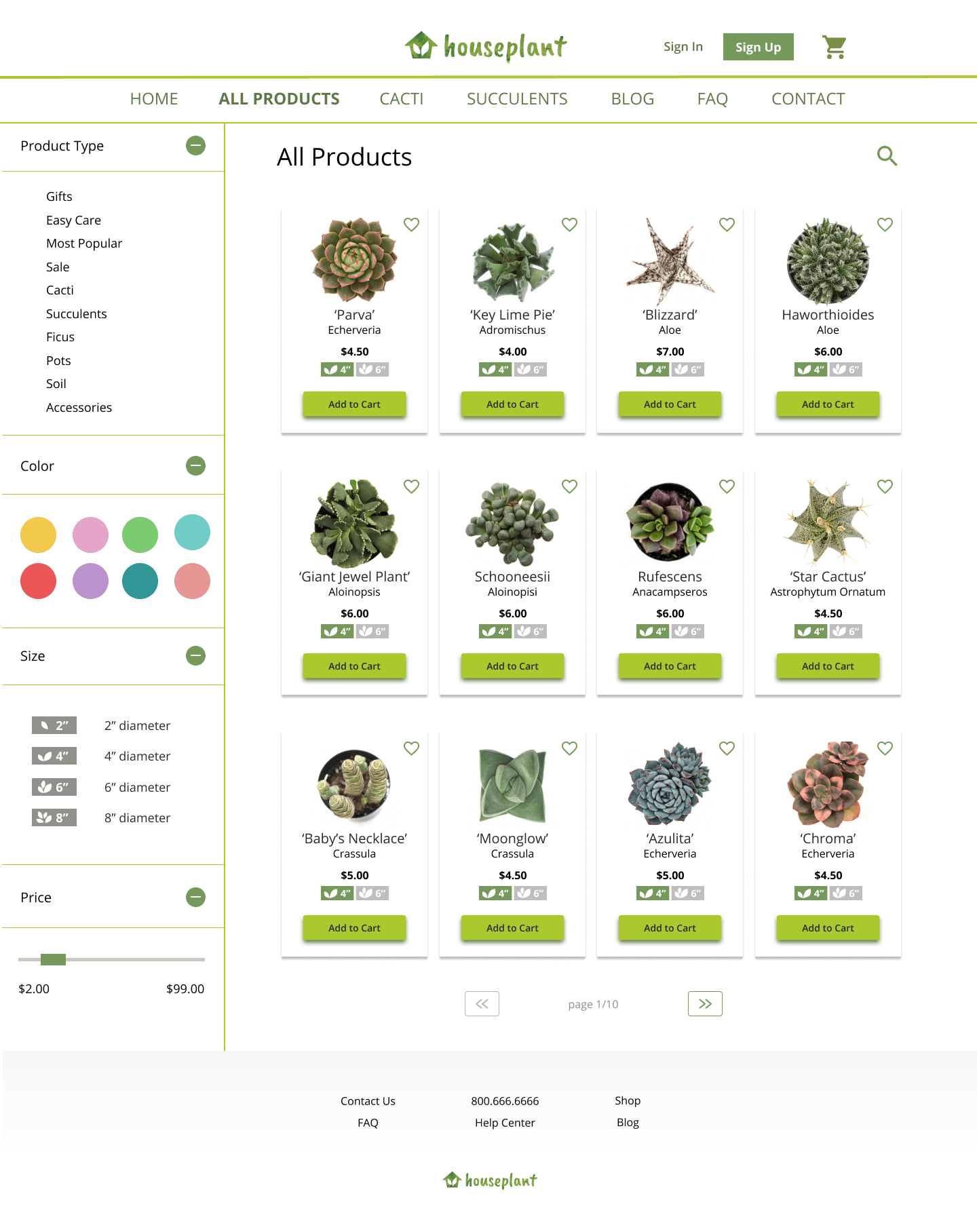
While designing the gallery page, I wanted to find the ideal amount of product information for users to see while browsing products.
I created 3 options: each with varying amounts of product information. Out of a group of 18 people, half chose the first, the other half chose the second, and no one chose the third. This test helped me narrow my options.
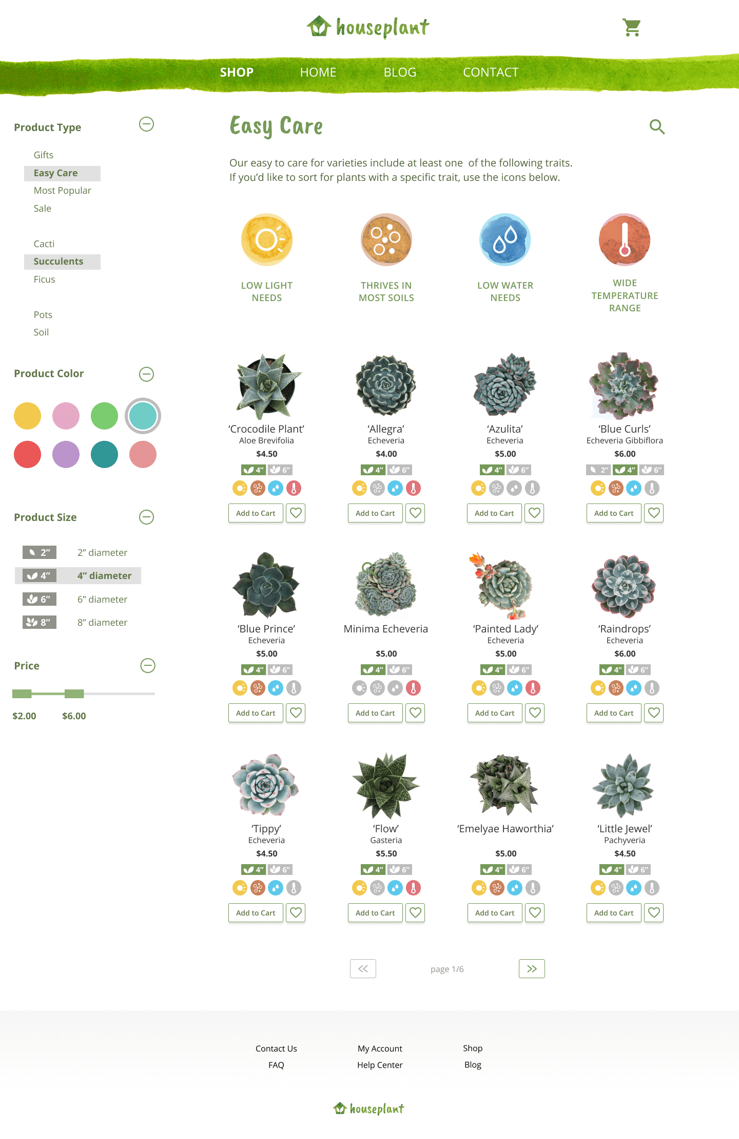
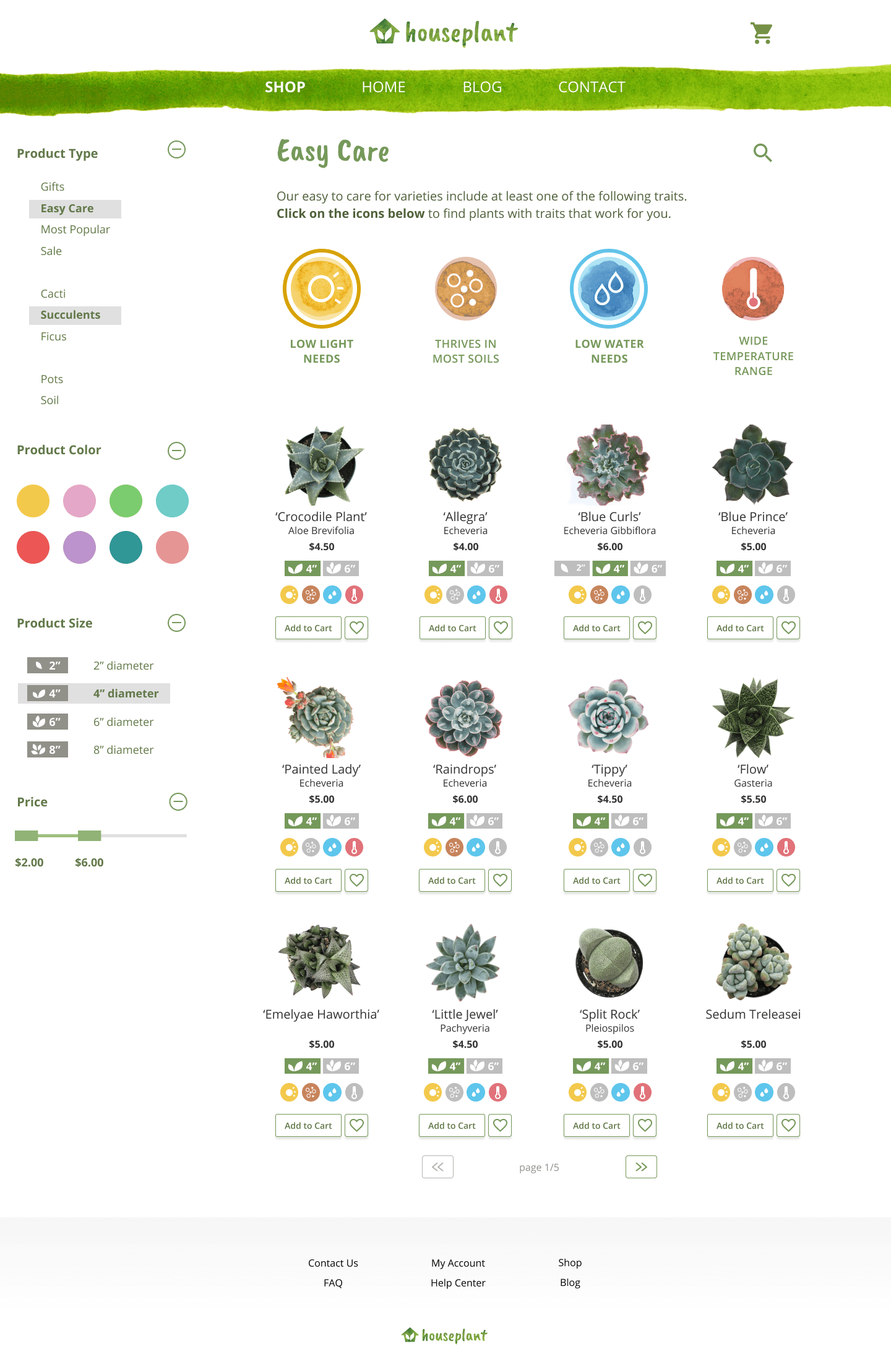
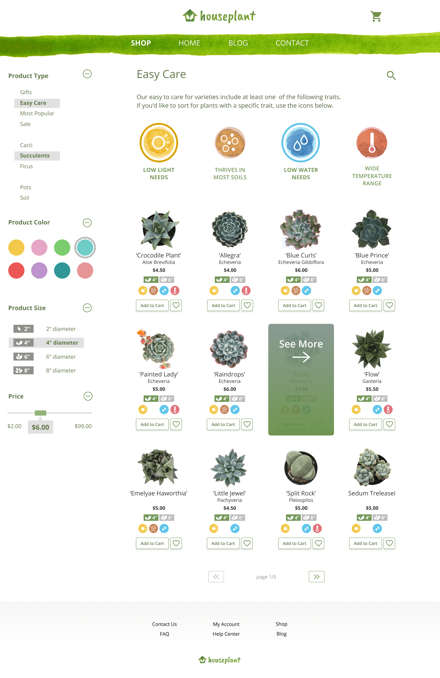
While preparing my wireframes and prototypes, I assumed that providing a section called 'easy care' would solve people’s plant care needs. However, as I recalled one particular interview, it became clear that the term ‘easy care’ was ambiguous.
What does it mean to people when they hear ‘easy care’? How can that differ for different people?
I re-defined ‘easy care', describing an 'easy care' plant as any plant that has one of the four following characteristics:
This allows users to choose from plants that are already suited to the user's environment or watering habits. Whether users live somewhere as cold as Norway or have an exceptionally dark apartment, they can have a variety of options for a beautiful plant.
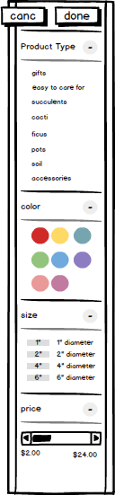
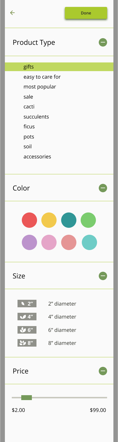
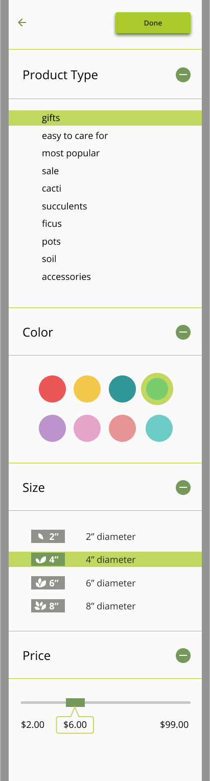
Using data from the preference test, I decided that to move forward with the 4 ‘easy care’ icons. From there, I iterated through various ways of distinguishing this filter from the rest of the store filters, trying to find a way to maintain some of the minimal aesthetic but still lend importance to this new section of the page.
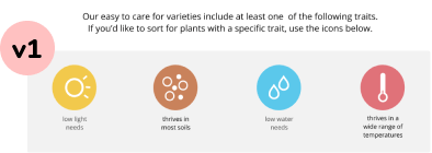
Version 1
I began with a gray background to try and differentiate the icons from the rest of the page.
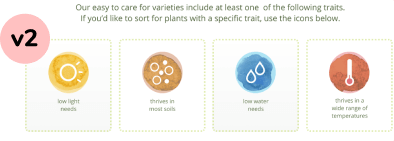
Version 2
Next I used a green dash outline to make the icons less heavy.
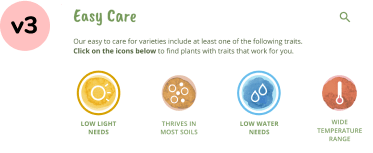
Version 3
The final look has no dash or background. Based on user feedback, I added bold text in the description above to indicate the toggle-ability for the icons.
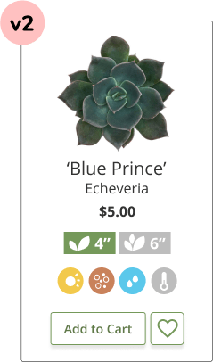
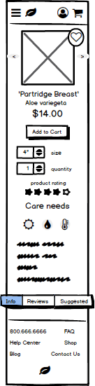
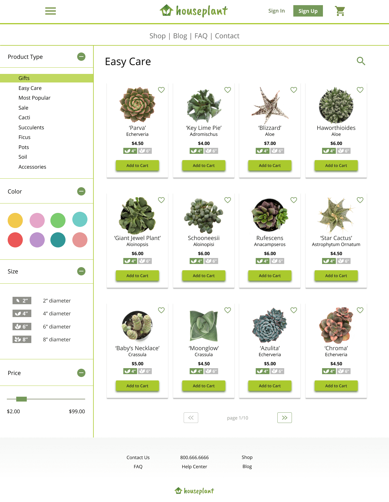
Following the design of the easy care filters, I received feedback on incorporating 'easy care' labels into each product card. This made it easier for customers to browse and compare products before delving further into the product information page.
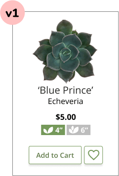
Version 1
Product card with no easy care filter labels.
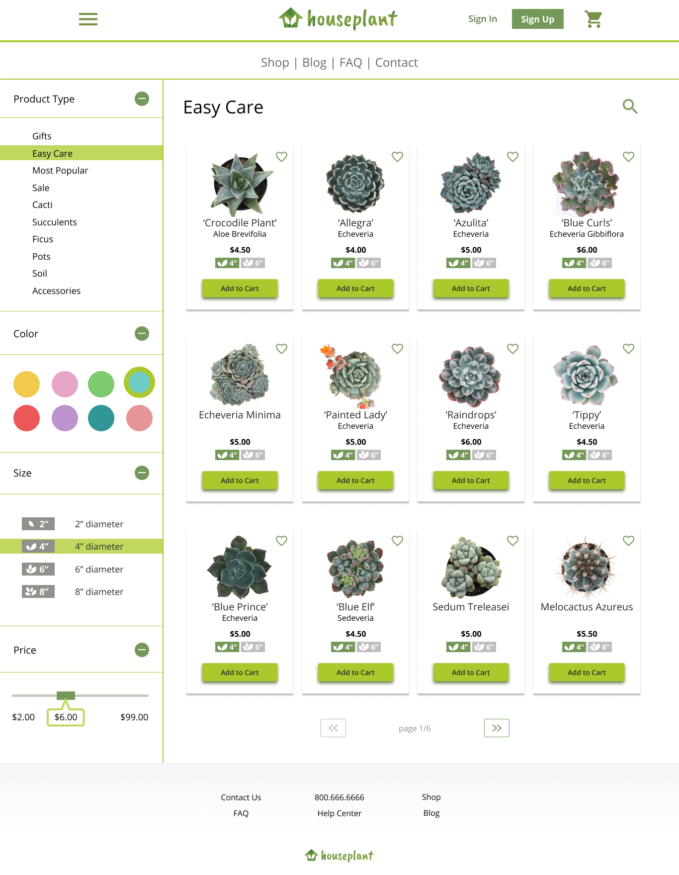
Version 2
Product card with added 'easy care' filter labels. The colors indicate that this plant performs well in low light and water as well as most types of soil.
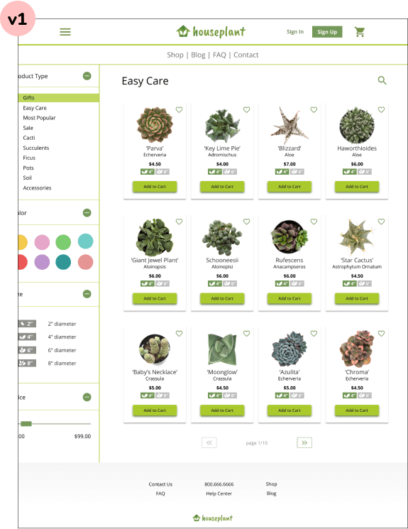
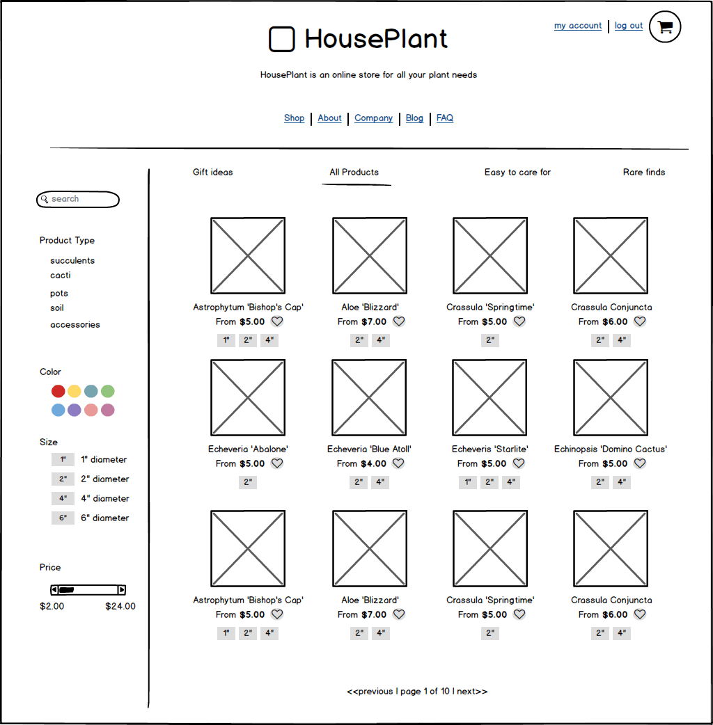
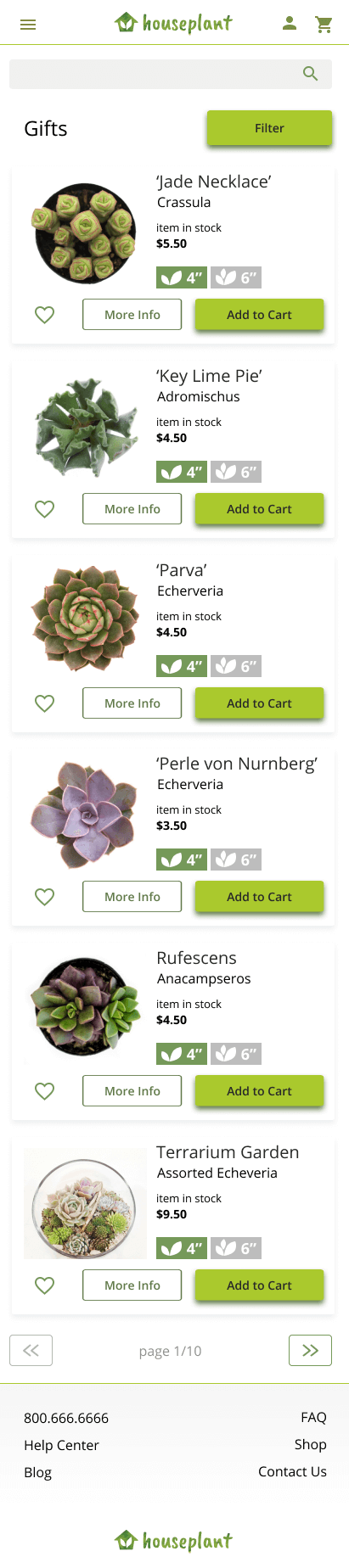
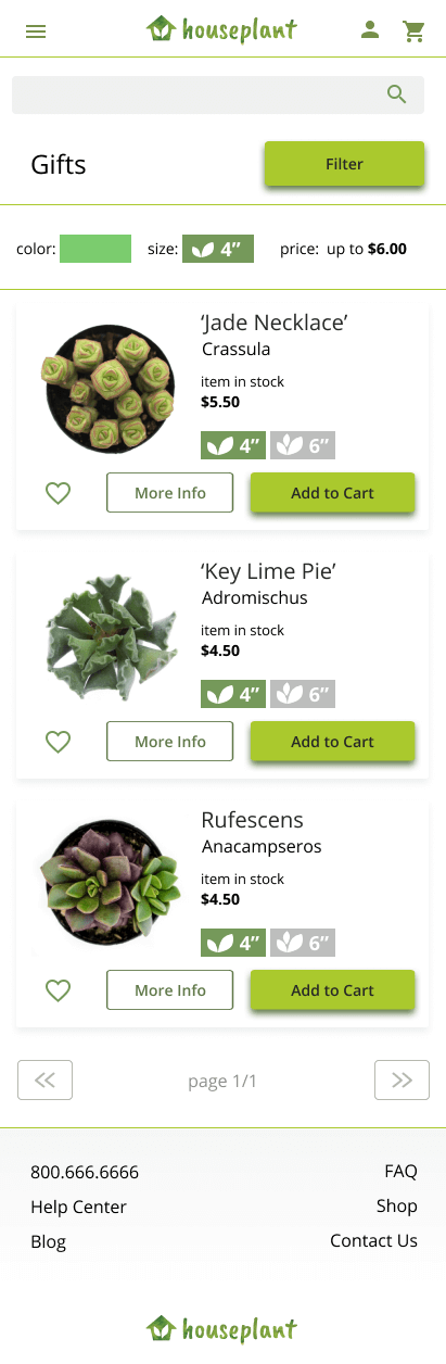
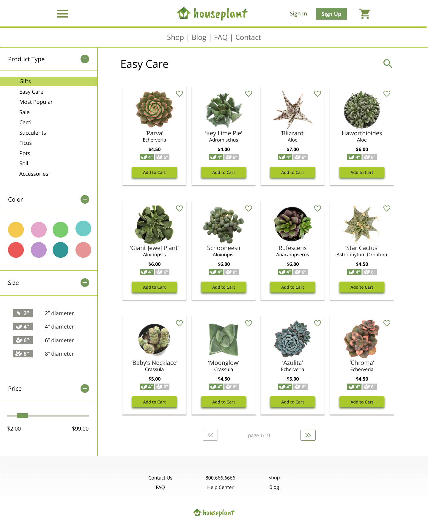
Here is a side by side comparison showing the old version of the gallery page on the left and the new one on the right including UX and UI changes based on testing and feedback.
Version 1
This is the 'easy care' page before adding filters.
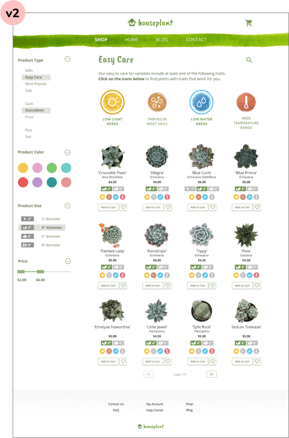
Version 2
This is the 'easy care' page after adding filters. When selected, the 'easy care' icons display a colored border. The product cards shown in the gallery also update to display only plants that meet the requirements of the selected icon.
After showing the prototype to my peers and friends, the project was well received. One person exclaimed that “I would totally buy a plant there!”. Another remarked that the ‘easy care’ filters made finding plants for their living situation easier.
As a result of this project, I learned the importance of testing early to achieve the structure of a working product early, allowing for more time to develop visuals and UI later in the process.
I also learned that I need to be always critical of the effectiveness of a solution, and look for ways to test that effectiveness as soon as possible.

RESEARCH / DESIGN / DEVELOP
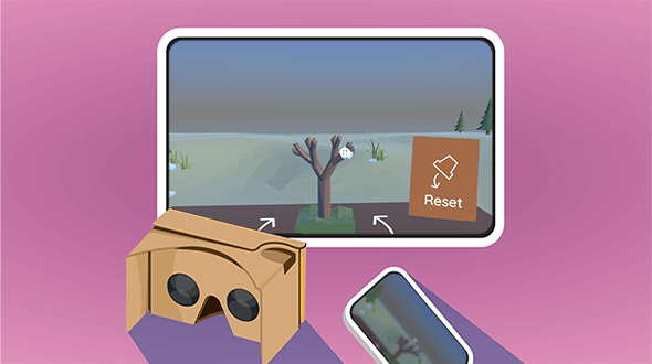
Grow and sculpt a bonsai tree,
in a relaxing virtual environment.
RESEARCH / WRITING / DESIGN
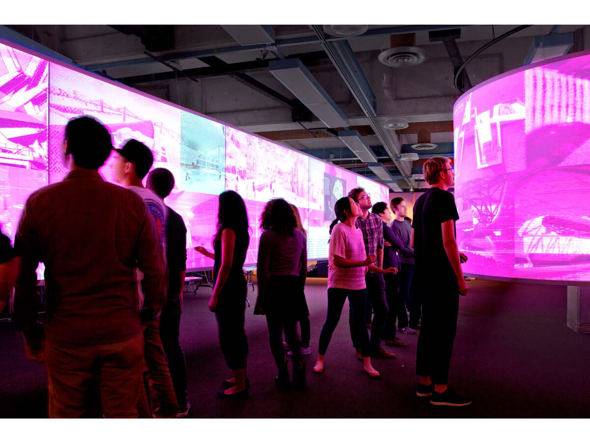
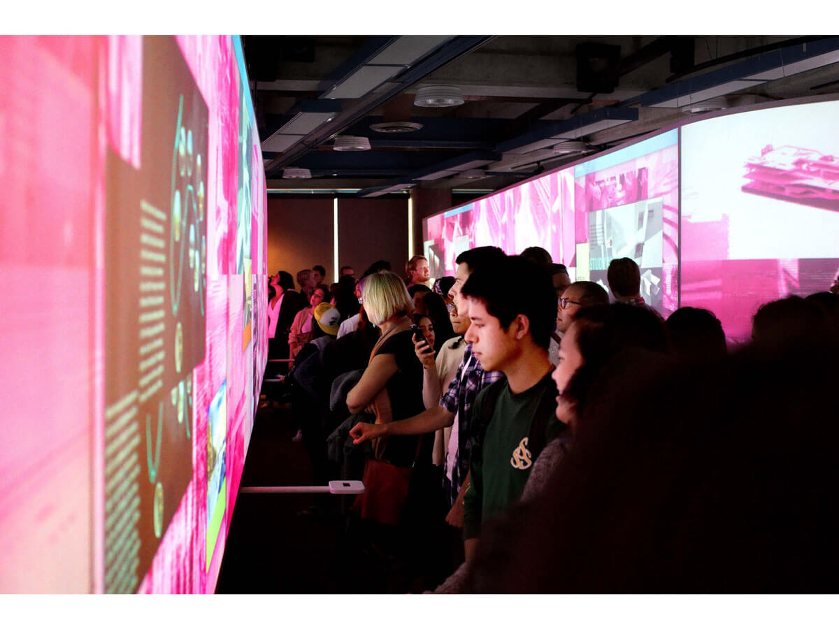
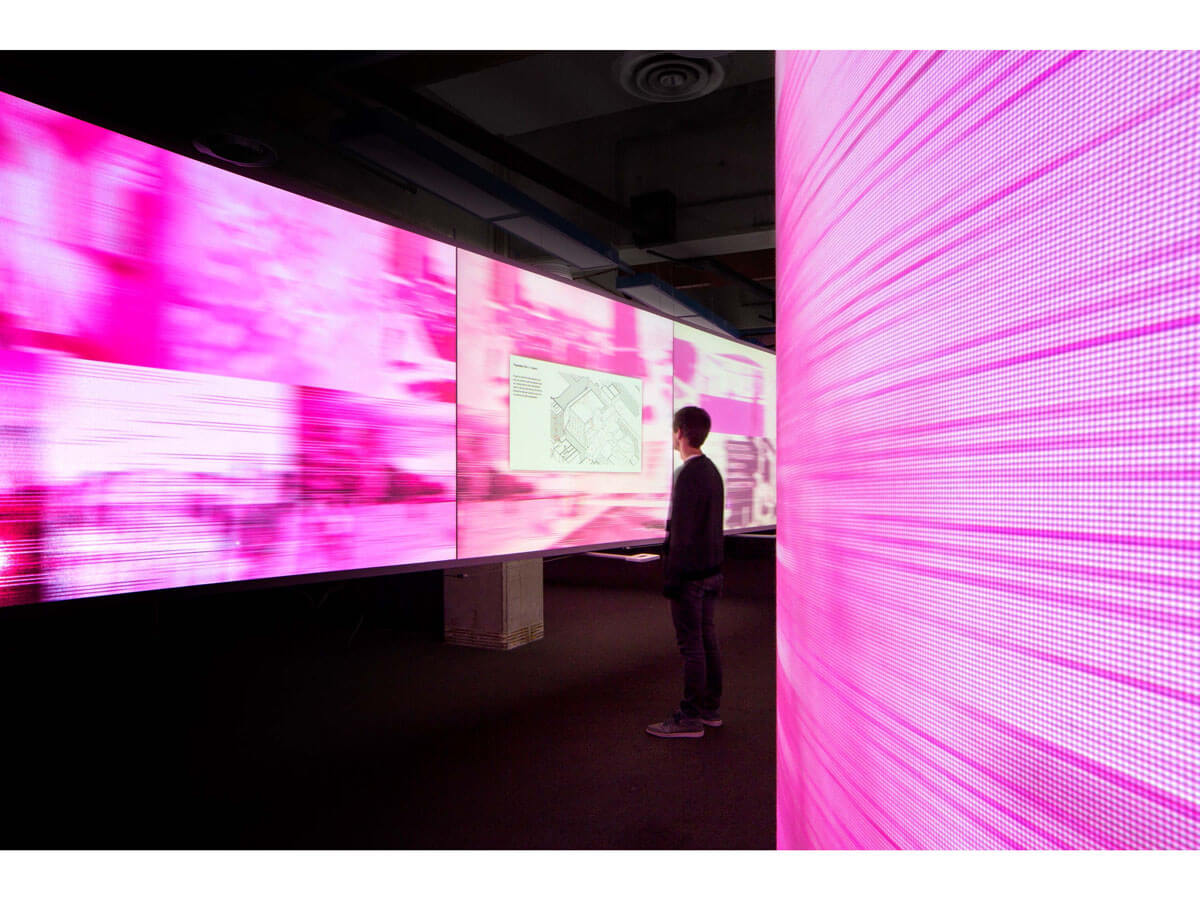
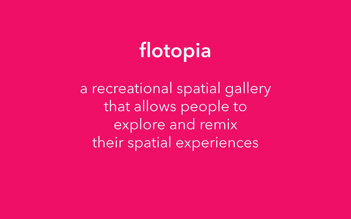
Where users can actively shape and design the architecture around them.


